

Dashboards
A dashboard is the landing view for a project. The Legacy dashboard is fixed and shows the project’s test case and execution summary. An Advanced dashboard is one you build from widgets, filter as a whole, and share by link.
Legacy dashboard
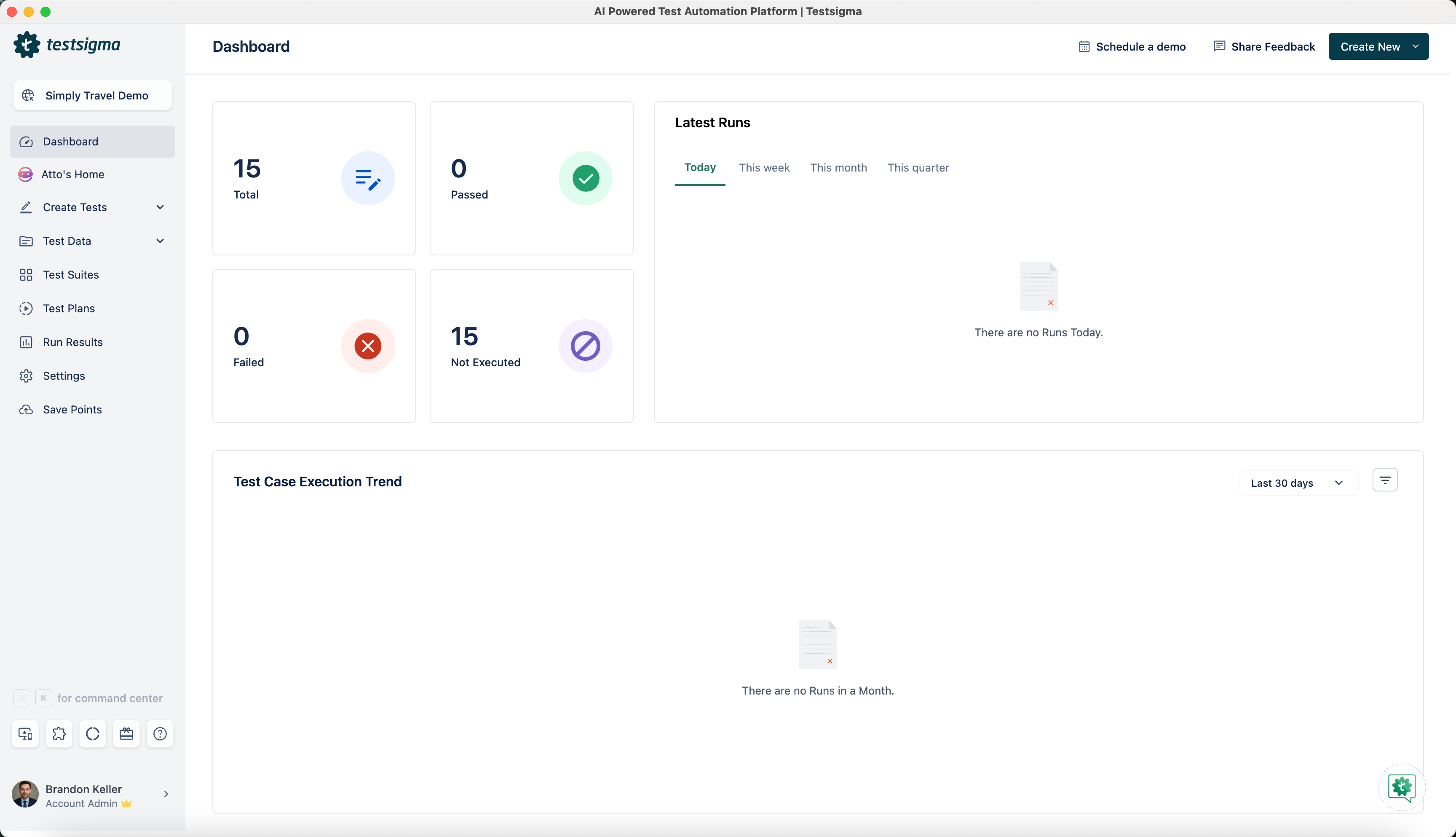
Section titled “Legacy dashboard”The Legacy dashboard reports on the project selected in the project switcher, in 7 sections.
- Test Case Overview: the total number of test cases, with counts for Passed, Failed, and Not Executed.
- Latest Runs: the latest executions for the project, filterable by Today, This week, This month, and This quarter.
- Test Case Execution Trend: a chart of the execution trend over the last 30 days.
- Review Management: test cases and elements under Submitted for review, with the reviewer’s name and the submission date, and those under Assigned for your review.
- Test Case Status: a donut chart by Draft, Inreview, Ready, Obsolete, and Rework.
- Test Case Type: a donut chart by Unit Test, Integration, Functional, Non Functional, and User Experience.
- Test Case Priority: a donut chart by Critical, Major, Medium, and Minor.
Create an advanced dashboard
Section titled “Create an advanced dashboard”The project needs at least one application and one completed test run before you start, or the widgets have no data to show.
-
Click Advanced next to Legacy on the Dashboard. Existing dashboards appear as tabs, and the list is empty the first time.
-
Click Create Dashboard, or click Create New + and select Dashboard.
-
Enter a name that conveys the dashboard’s purpose and audience, such as
Release Readiness - Q2 2026orTeam Velocity Tracker. -
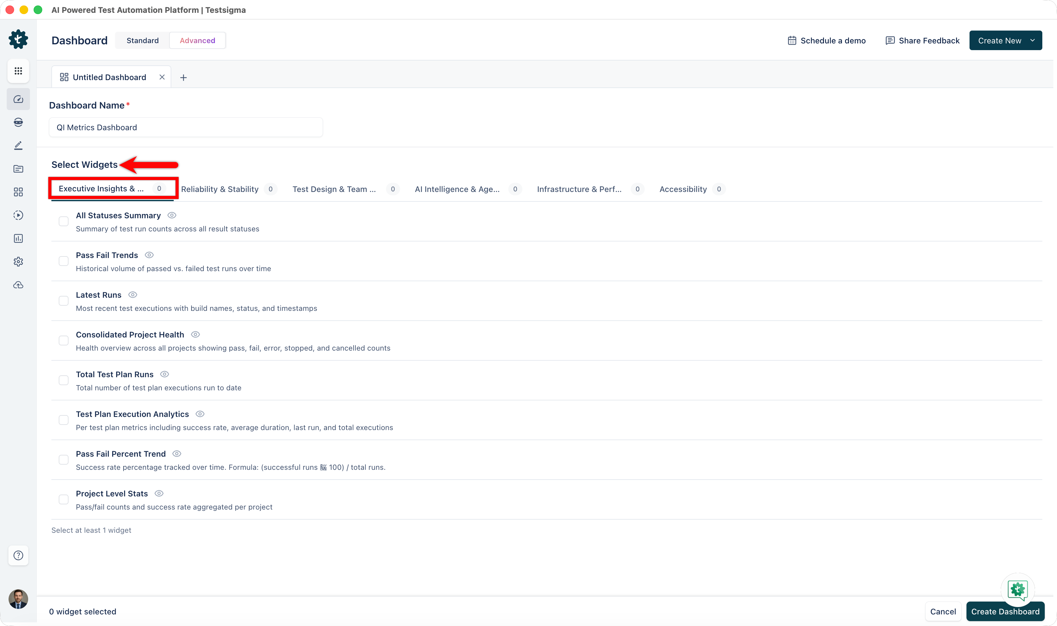
Select the widgets from the library. You can mix categories, and clicking the eye icon on a widget previews it first.
-
Click Create Dashboard.
The dashboard opens with its widgets in place, and they update as test executions complete.
Filter a dashboard
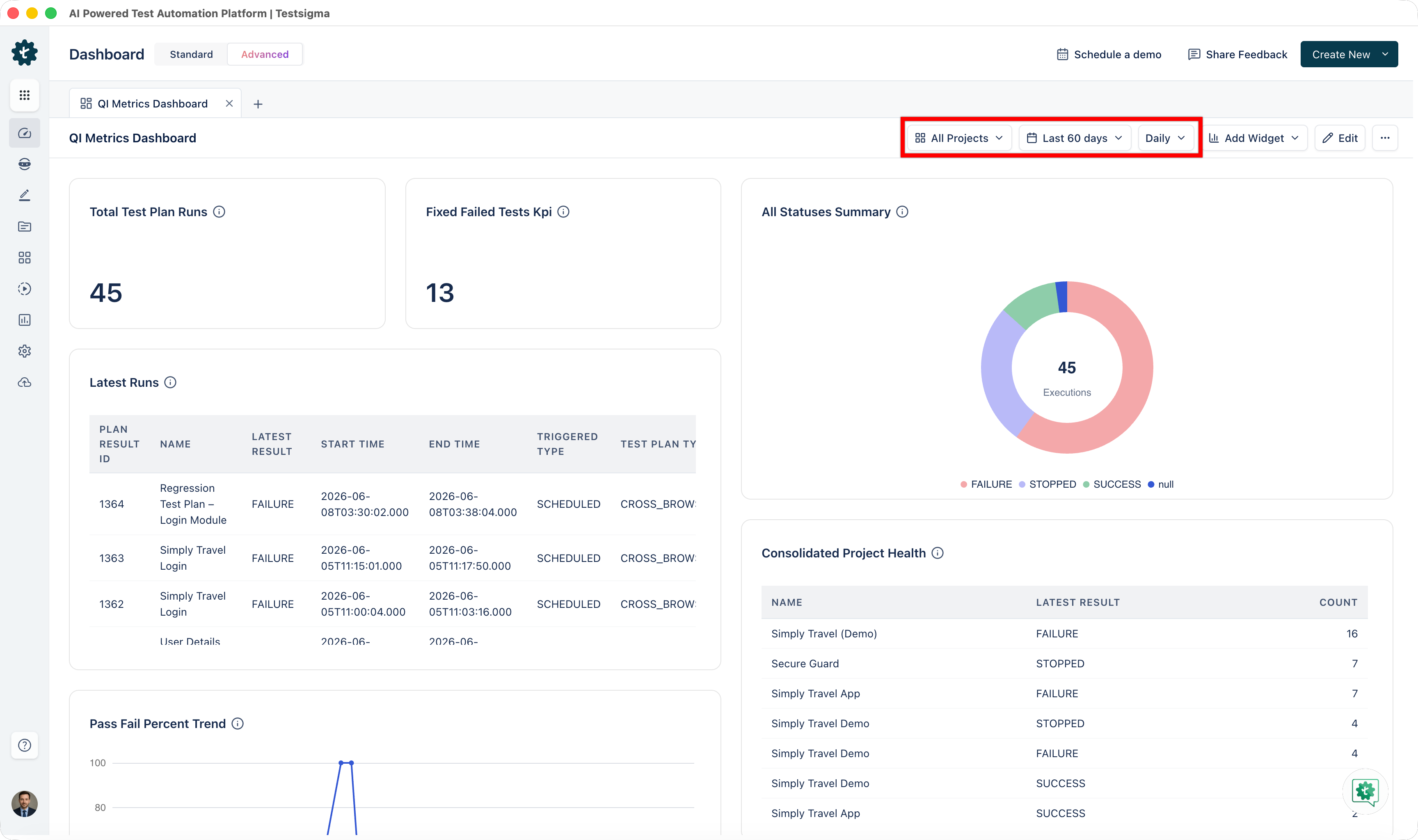
Section titled “Filter a dashboard”The filter controls sit at the top of the dashboard and apply to every widget at once.
- Project: scopes the data to a project, application, and version, or to All Projects for an aggregated view.
- Date range: recent hours from 3 to 24, current periods for Today, This Week, This Month, and This Quarter, longer ranges from the last 3 to 60 days, or Custom Date.
- Interval: groups the data Hourly, Daily, Weekly, Monthly, Quarterly, or Yearly.
Edit a dashboard
Section titled “Edit a dashboard”-
Click Advanced on the Dashboard and open the dashboard you want to change.
-
Click Edit.
-
Click Add Widgets to open the library. Widgets already on the dashboard are highlighted.
-
Hover over a widget to remove it with the Delete icon, or to drag it into a new position.
-
Click Save Changes.
Share a dashboard
Section titled “Share a dashboard”Go to More Options > Share on the dashboard, click Create shareable link, then click Copy link.
Anyone with the link can view the dashboard in read-only mode.
Widgets
Section titled “Widgets”The library holds 40 widgets in 6 categories. Selecting one shows its description, what it is for, and how to read what it displays.
Executive insights and release readiness
Section titled “Executive insights and release readiness”All Statuses Summary, Pass Fail Trends, Latest Runs, Consolidated Project Health, Total Test Plan Runs, Test Plan Execution Analytics, Pass Fail Percent Trend, and Project Level Stats.
This category answers whether a release is safe to ship. A high pass count with a low fail count is healthy. A high Error count points at infrastructure rather than at the application. On Test Plan Execution Analytics, a low success rate means flakiness and a high duration means a bottleneck, so sorting by duration finds the slowest plans.
Reliability and stability
Section titled “Reliability and stability”Test Health Snapshot, Flaky Test List, Top Failing Tests By User, Top Failing Tests By Day, Error Statistics, Top Error Types, Time To Fix Test KPI, and Stability Ratios.
Reliability widgets find what to stabilize first. Test Health Snapshot classifies suites as Consistent, Flaky, or Unexecuted, and a Consistent share above 80% is the target, while a high Unexecuted share points at coverage gaps rather than instability. Flaky Test List ranks tests by flake score, and a high score usually means a timing or resource dependency, so the top of that list is where stabilization starts.
Test design and team productivity
Section titled “Test design and team productivity”Tests Authored Over Time, New Tests Per User, Fixed Failed Tests Per User, Fixed Failed Tests KPI, Tests Authored Vs Executed, Stale Assets By Category, Distribution By Priority / Status / Type, Authored By App Type, and Test Cases Submitted/Assigned For Review.
Productivity widgets track authoring velocity, who is contributing, and which assets have gone stale. Flat or declining columns on Tests Authored Over Time mean either saturation or a resource constraint, and low fix counts across the whole team on Fixed Failed Tests Per User mean flaky tests are accumulating.
AI intelligence and agentic ROI
Section titled “AI intelligence and agentic ROI”AI Vs Manual Composition, Auto Healing Trend, and NLP Usage Ranked List.
AI widgets show what AI-assisted authoring and Auto Healing are returning. Auto Healing Trend compares failed steps against auto-healed ones, and each healed step is manual effort avoided.
Infrastructure and performance
Section titled “Infrastructure and performance”Concurrency Utilization Sessions, Execution Duration Trend, Environment Coverage, and App Coverage By Type.
Infrastructure widgets show resource use and where the bottlenecks are, before they cause delays. On Concurrency Utilization Sessions, the gap between sessions used and your configured limit is spare capacity, and running near the limit constantly means it is time to expand. Execution Duration Trend carries average, median, and p95 durations, so a sudden spike is a performance regression rather than a slow drift.
Accessibility
Section titled “Accessibility”Compliance Score, Issues by Severity, Issues by WCAG Criterion, Trend Over Time, Top Issues, Page-Level Health, VPAT Readiness, and Remediation Progress.
Accessibility widgets track WCAG conformance, how many issues remain open by severity, and remediation progress. Compliance Score breaks conformance down by level, and a low A-level score means critical gaps that block basic accessibility requirements, whatever the overall figure looks like.
Every accessibility widget reads from the Standard Selector at the top of the dashboard, which maps your existing test data to the standard you pick without needing new runs. The available standards are WCAG 2.2, ADA, Section 508, EAA, and EN 301 549. The default is WCAG 2.2 AA, and the selection persists per application.
Starting combinations
Section titled “Starting combinations”| Dashboard | Widgets |
|---|---|
| Release readiness | All Statuses Summary, Pass Fail Trends, Latest Runs, Consolidated Project Health |
| Quality improvement | Flaky Test List, Top Failing Tests By User, Error Statistics, Time To Fix Test KPI |
| Team productivity | Tests Authored Over Time, New Tests Per User, Fixed Failed Tests Per User, Stale Assets By Category |
| AI investment | AI Vs Manual Composition, Auto Healing Trend, NLP Usage Ranked List |
| Infrastructure planning | Concurrency Utilization Sessions, Execution Duration Trend, Environment Coverage, App Coverage By Type |
| Accessibility compliance | Compliance Score, Issues by Severity, Trend Over Time, Remediation Progress |
Was this page helpful?
Thanks for the feedback.