


Hey there! Welcome to our guide on CSS header. Here, we’ll look at the different types of headers and how to use them. We’ll also review some features and techniques to make your headers look professional and excellent. Whether you’re new to web development or an experienced coder, this guide has something for everyone. After reading this guide, you’ll have all the skills you need to design amazing headers for your website – so let’s get started!
Table Of Contents
Key Takeaways
Definition: A CSS header is the top section of a webpage typically housing the logo, navigation, and search elements.
Core Tags: Use the semantic <header> tag and structured heading tags (H1-H6) for better SEO and accessibility.
Styling Versatility: Headers can be enhanced with solid colors, gradients, background images, or sticky positioning.
Interactive Elements: Effective headers often include Call to Action (CTA) buttons and social media icons to drive engagement.
Mobile-First: With nearly 60% of traffic coming from mobile, responsive design using media queries is mandatory.
What is CSS Header?
In CSS (Cascading Style Sheets), a header is a block of content at the top of a webpage that usually contains a logo, navigation links, and possibly other elements such as search fields or social media icons. The header is typically the first thing visitors see when they arrive at a webpage, and it usually spans the entire page width.
It is often styled differently than the rest of the page to set it apart and draw the visitor’s attention visually. You can use CSS to customize the appearance of your webpage’s header, including its font, color, size, background, and other design elements.
Different websites use different headers to capture their audience’s attention. Here are some CSS header examples:
As you can see, all of the websites listed above have unique header designs with different menus.
Now that we know what CSS headers are and what they contain let’s take a closer look at how to create them.
Components of CSS Header Properties:
Headers are made up of different types of content like text, tags, logos, images, social media icons, etc., as seen from the examples in the last section. Here are some of the most important aspects of a CSS header:
Header Tag:
In HTML, the <header> tag is used to define the header of a web page or section of a web page. The <header> tag is typically used to contain the site logo, navigation, and other elements such as the page or section title and author information. The <header> tag can be used as a container for these elements and can be styled using Cascading Style Sheets (CSS).
Here is an example of the <header> tag in HTML:
1
2<header>
3  <nav>
4    <ul>
5      <li><a href="#">Home</a></li>
6      <li><a href="#">About</a></li>
7      <li><a href="#">Contact</a></li>
8    </ul>
9  </nav>
10  <img decoding="async" src="logo.png" alt="Site logo">
11  <h1><span id="Welcome_to_my_site">Welcome to my site</span></h1>
12<p>This is a paragraph of text.</p>
13</header>
14
This example shows an <header> element that contains a logo, a navigation menu, and a page title. The <header> element and its contents can be styled using CSS to control the layout and appearance of the header.
Heading Tags:
Heading tags are HTML tags used to create headings and subheadings in an HTML document. They range from <h1> to <h6>, with <h1> being the most important and <h6> being the least important. Headings help organize and structure the content on a webpage and make it easier for users to understand the information hierarchy.
They also help users with assistive technologies, such as screen readers, navigate and understand the content on a webpage.
1
2<h1><span id="Main_heading">Main heading</span></h1>
3<h2><span id="Subheading">Subheading</span></h2>
4<h3><span id="Sub-subheading">Sub-subheading</span></h3>
5<h4><span id="sub-sub-subheading">sub-sub-subheading</span></h4>
6<h5><span id="sub-sub-sub-subheading">sub-sub-sub-subheading</span></h5>
7<h6><span id="sub-sub-sub-sub-subheading">sub-sub-sub-sub-subheading</span></h6>
8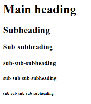
Here is an example of how you might use heading tags in an HTML document:
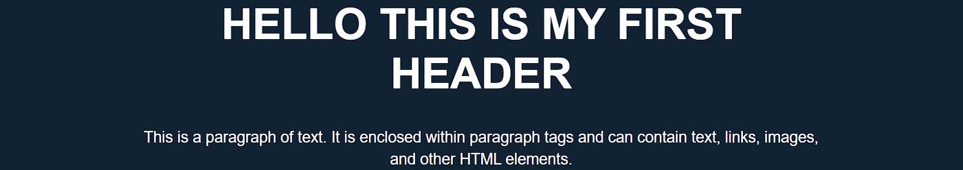
HTML:
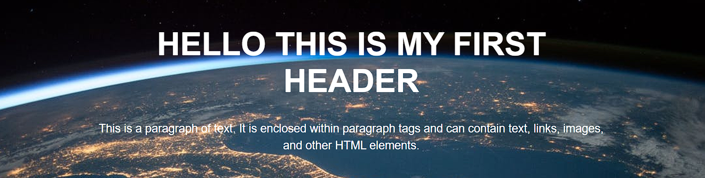
1
2<header>
3<div class="main-heading">
4  <h1><span id="HELLO_THIS_IS_MY_FIRST_HEADER">HELLO THIS IS MY FIRST HEADER</span></h1>
5  <p>This is a paragraph of text. It is enclosed within paragraph tags and can contain text, links, images, and other HTML elements.</p>
6</div>
7</header>
8CSS:
1
2header {
3  margin: 0;
4  font-family: Arial, Helvetica, sans-serif;
5  background-color: #123;
6  color: white;
7}
8
9
10.main-heading{
11  max-width: 800px;
12  text-align: center;
13  margin: auto;
14}
15
16
17.main-heading h1{
18  font-size: 50px;
19}
20
Output:

In this example, the main heading rendered a large, bold font, the subheading would be slightly smaller and less bold, and the sub-subheading would be even smaller and less bold.
Paragraph Tag:
The paragraph tag, <p>, is an HTML element used to define a paragraph of text. It is used to enclose a block of text within an HTML document and apply a set of styles to the text. Here is an example of how you might use the paragraph tag in an HTML document:
<p>This is a paragraph of text. It is enclosed within paragraph tags and can contain text, links, images, and other HTML elements.</p>
<p>This is a paragraph of text. It is enclosed within paragraph tags and can contain text, links, images, and other HTML elements.</p>
When rendered by a web browser, the text within the paragraph tags will be displayed as a block of text with the default styles, such as font size and font family. The paragraph tag is often used with other HTML tags, such as heading tags, to create a well-structured and easy-to-read document.
Header Background:
A header background is a design element that appears behind the content of a header, which is typically the top section of a webpage. The header background can be a solid color, a gradient color, an image, or a combination.
To set the header background in HTML, you can use the style attribute and the background property. Here is an example of how you might set the header background of the header:
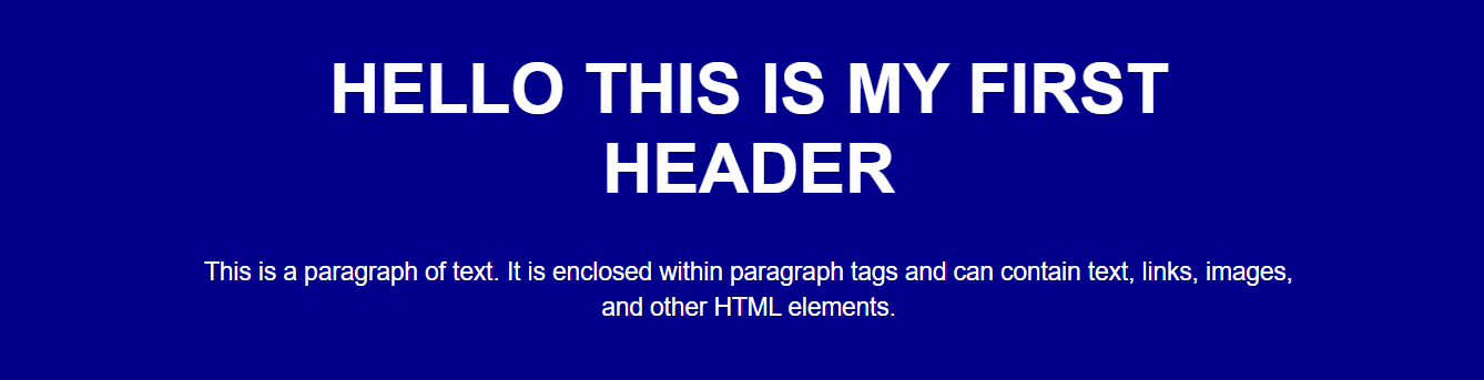
Example 1: Styling the background color as dark blue
1
2<header style="background-color: darkblue;">
3  <div class="main-heading">
4    <h1><span id="HELLO_THIS_IS_MY_FIRST_HEADER-2">HELLO THIS IS MY FIRST HEADER</span></h1>
5    <p>This is a paragraph of text. It is enclosed within paragraph tags and can contain text, links, images, and other HTML elements.</p>
6  </div>
7</header>
8Output:
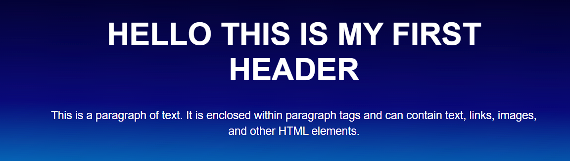
Example 2: Adding Gradient color in the background. If the gradient color seems complex you can use this website to generate the gradient code: cssgradient.io
1
2<header style="background: linear-gradient(181deg, rgba(2,0,36,1) 0%, rgba(9,9,121,1) 48%, rgba(0,212,255,1) 100%)">
3	….
4</header>
5Output:
Example 3: Adding an image in the background
1
2<header style="background-image: URL(https://images.pexels.com/photos/220201/pexels-photo-220201.jpeg?auto=compress&cs=tinysrgb&w=1260&h=750&dpr=1); background-repeat: no-repeat; background-size: cover;">
3 …
4 </header>
5Output:
These examples are most commonly used in the CSS header. Still, in modern web design, developers use more complex designs that include animation, video, image sliders, interactive elements, and more.
Navbar:
A navbar, or navigation bar, is a user interface element that contains links to the main sections of a website or application. Navbars are typically displayed at the top of a page or screen, allowing users to quickly access different pages or content within a website or app.
Several components are commonly found in a navbar:
- Logo: Utilizing a logo maker can simplify the process of creating a professional and unique logo that effectively represents your brand.
- Links: The primary purpose of a navbar is to provide access to different pages or content within a website or app, so it typically includes a set of links that allow users to navigate to other sections of the site.
- Search bar: Some navbars include a search bar that allows users to search for specific content within the website or app.
- Button: Navbars may also include a button that allows users to perform a specific action, such as signing up for a newsletter or logging in to an account.
Overall, navbars are an essential component of many websites and applications because they allow users to easily navigate and access the different pages and content.
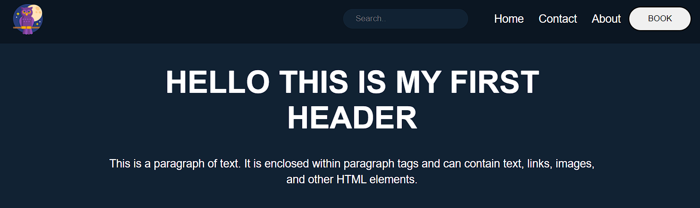
Here is an example of how you might add a navbar in your header:
HTML:
1
2
3  <header>
4    <div class="header">
5      <a href="#" class="logo"><img decoding="async" src="https://geekyhumans.com/wp-content/uploads/2022/09/owl.png?ezimgfmt=ng%3Awebp%2Fngcb5%2Frs%3Adevice%2Frscb5-1" alt="CSS Header"></a>
6      <div class="header-right">
7
8
9        <div class="search-container">
10          <form action="/action_page.php">
11            <input type="text" placeholder="Search.." name="search">
12          </form>
13        </div>
14
15
16        <a class="active" href="#home">Home</a>
17        <a href="#contact">Contact</a>
18        <a href="#about">About</a>
19
20
21        <button class="book-button">BOOK</button>
22      </div>
23
24    </div>
25
26
27    <div class="main-heading">
28      <h1><span id="HELLO_THIS_IS_MY_FIRST_HEADER-3">HELLO THIS IS MY FIRST HEADER</span></h1>
29      <p>This is a paragraph of text. It is enclosed within paragraph tags and can contain text, links, images, and
30        other HTML elements.</p>
31    </div>
32  </header>
33
34
35
36CSS:
1
2body {
3  margin: 0;
4  background-color: #123;
5}
6
7
8header {
9  margin: 0;
10  font-family: Arial, Helvetica, sans-serif;
11  background-color: #123;
12  color: white;
13  min-height: 50vh;
14  padding: 0px;
15}
16
17
18.main-heading {
19  max-width: 800px;
20  text-align: center;
21  margin: auto;
22}
23
24
25.main-heading h1 {
26  font-size: 50px;
27}
28
29
30.main-heading p {
31  font-size: 18px;
32  line-height: 26px;
33}
34
35
36.header {
37  overflow: hidden;
38  background-color: #0b1622;
39  padding: 10px 20px;
40}
41
42
43.header img {
44  width: 50px;
45}
46
47
48.header a {
49  float: left;
50  color: rgb(255, 255, 255);
51  text-align: center;
52  padding: 12px;
53  text-decoration: none;
54  font-size: 18px;
55  line-height: 25px;
56  border-radius: 4px;
57}
58
59
60
61
62input[type=”text” i]{
63  padding: 8px 20px;
64  border-radius: 50px;
65  background-color: #123;
66  border-color: white;
67  margin-right: 30px;
68  border: 0;
69}
70
71
72.book-button{
73  padding: 10px 30px;
74  border-radius: 50px;
75}
76
77
78
79
80.header a.logo {
81  font-size: 25px;
82  font-weight: bold;
83  padding: 0 !important;
84}
85
86
87
88
89.header-right {
90  float: right;
91  display: flex;
92  align-items: center;
93}
94
95
96@media screen and (max-width: 500px) {
97  .header a {
98    float: none;
99    display: block;
100    text-align: left;
101  }
102
103
104  .header-right {
105    float: none;
106  }
107}
108Output:
Sticky Navbar:
A sticky navbar is a navigation bar that remains fixed to the top of the screen as the user scrolls down the page. This can be helpful because it allows users to access the navigation menu at all times without having to scroll back up to the top of the page.
To create a sticky navbar using CSS, you can use the position: sticky property in the navbar’s styling rule.
For example
1
2header {
3  margin: 0;
4  font-family: Arial, Helvetica, sans-serif;
5  background-color: #123;
6  color: white;
7  min-height: 50vh;
8  padding: 0px;
9  position: static;
10  top: 0;
11}
12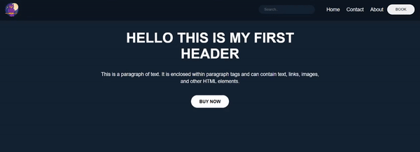
Call to Action:
A call to action (CTA) is a message or button that prompts the user to take a specific action, such as signing up for a newsletter, purchasing a product, or downloading an app.
A CTA can effectively engage users and guide them toward a specific goal in the header context. By prominently displaying a CTA in the header, you can make it more visible to users and increase the likelihood that they will take the desired action.
Call to Action Example
For example, if your website sells a product, you might include a CTA in the header that says “Buy Now” or “Add to Cart.” This makes it easy for users to quickly purchase the product without searching for the appropriate link elsewhere on the site.
Here is an example of how you might add a call to action:
Social Media Icons:
Adding social media icons to a header is a common practice because it provides users an easy way to connect with the company or brand on social media platforms.
By including social media icons in the header, users can quickly and easily access the company’s social media profiles, which can help to increase the brand’s online presence and engagement. This can be especially important for businesses that rely on social media to connect with customers and promote their products or services.
You can add icons to your header in many ways, but the most popular and common practice is to use Font Awesome.
To use an icon from Font Awesome, you will need to include the Font Awesome library in your project by linking to the hosted version on the Font Awesome website or downloading and hosting the files locally.
Once you have the library installed, you can use an icon by placing the icon element inside your HTML code and setting the class name to “fa fa-ICONNAME”, where “ICONNAME” is the title of the icon you need to use.
Social Media Icons Example
For example, to use the “search” icon, you would use the following code:
1
2<a href="#" class="fa fa-facebook"></a>
3        <a href="#" class="fa fa-twitter"></a>
4        <a href="#" class="fa fa-Instagram"></a>
5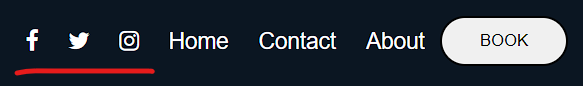
Responsive Web Design:
Responsive web design is a design approach that aims to make web pages look good on all devices (desktops, tablets, and phones). It involves using CSS media queries and flexible layouts to adjust the design of a website to the size of the device’s screen. This helps ensure that users have a consistent, positive experience no matter what device they use to access the website.
According to Oberlo, as of 2022, 59.4% of all website traffic worldwide was generated through mobile phones. This number has been steadily increasing in recent years, and it’s clear that websites need to be designed with mobile devices in mind.
How to Create a Responsive Web Design?
You must combine HTML, CSS, and JavaScript to create a responsive web design. Here are the steps you can follow to create a responsive web design:
- Determine the purpose and content of your website. This will help you decide on the layout and design best suits your needs.
- Choose a layout. Many different layout options exist, including fixed, fluid, and hybrid layouts.
- Use CSS media queries to specify the design adjustments that should be made for different screen sizes. Media queries allow you to apply different styles to your website based on the width of the device’s screen.
- Test your website on multiple devices to ensure that it looks and functions correctly on all of them.
- Optimize your website for mobile devices. This may include compressing and using responsive images to ensure the website loads quickly on mobile devices.
- Optimize the navigation bar using the hamburger menu.
- Regularly test and update your website to ensure it continues functioning correctly on all devices.
To learn more about how to make your website responsive, check out the w3school for in-depth details.
In addition, Google recommends responsive web design as its preferred mobile configuration, making it easier for Google’s algorithms to crawl and index a website’s content. This can positively impact the search engine rankings of a website.
Useful Tips for Styling Header Texts:
Here are a few more tips for styling header texts:
- Use hierarchy to indicate the importance of different headers. You can do this by using different font sizes, weights, and styles for different levels of headings.
- Keep your headers concise and to the point. Avoid using long, wordy titles that are difficult to read.
- Use white space to make your headers more visually appealing. Adding extra room around your headers makes them stand out and draw the reader’s attention.
- Experiment with different font combinations to find the right look for your website. You can use tools like Google Fonts to explore other font options and see how they look together.
- Test your headers on different devices to ensure they are legible and look good on all screen sizes.
Conclusion:
Finally, this guide has given you a thorough understanding of how to construct and style headers with CSS. We’ve gone over the many sorts of headers and their applications, as well as the characteristics and strategies used to style them. You are now armed with the information and abilities obtained to develop professional-looking headers for your website that will improve the user experience. Thank you for taking the time to read!
Frequently Asked Questions:
Use the h1 selector in your stylesheet to define properties like font-size, color, and text-align.
Target the header element directly in your CSS to modify its layout, background, and positioning.
Headers provide immediate context, branding, and navigation, helping users understand the site’s purpose and move between sections.

