
Table Of Contents
- 1 Overview
- 2 What is Screen Resolution?
- 3 History of Screen Resolutions
- 4 Why does Screen Resolutions Matter?
- 5 What is the Most Common Screen Resolutions Today?
- 6 Desktop vs Mobile vs Tablet Common Screen Resolutions
- 7 How do You Find the Ideal Screen Size for Responsive Design?
- 8 Top 10 Most Common Screen Resolutions
- 9 How to do a Screen Resolution Test?
- 10 Automate Your Tests for Different Screen Resolutions with Testsigma
- 11 Mobile Screen Resolution Stats Worldwide
- 12 Desktop Screen Resolution Stats Worldwide
- 13 Tablet Screen Resolution Stats Worldwide
- 14 Desktop vs Mobile vs Tablet Worldwide
- 15 Why Website Dimensions Matter in Web Design and Development?
- 16 How to Check Your Screen Resolution?
- 17 How To Change Your Screen Resolution
- 18 How To Decide Which Screen Resolution To Optimize Your Website For?
- 19 Takeaways On Website Dimensions
- 20 Frequently Asked Questions
Overview
What is Screen Resolution?
It refers to the total count of pixels arranged horizontally and vertically on a screen, like 1920×1080. A higher pixel count results in sharper visuals and influences how websites and apps appear on a display.
What are the Most Common Screen Resolutions Today?
- 1920×1080 (Full HD): standard for most HDTVs and monitors
- 1366×768 (HD): often seen in budget laptops
- 1440×900 (WXGA+): mid-range option
- 1600×900 (WXGA): slightly higher than HD
- 3840×2160 (4K UHD): for high-end displays and detailed visuals
What is My Screen Resolution? Check Here
What is Screen Resolution?
Screen resolution is the number of pixels displayed on a screen in each dimension, horizontally and vertically. It is expressed as a pair of integers, such as 1920×1080, representing a screen displaying 1920 pixels horizontally and 1080 pixels vertically.
Pixels are the smallest individual elements that make up a digital image. The higher the screen resolution, the more pixels the screen can display, and the sharper and more detailed the image will appear.
Screen resolution is essential when choosing a display device, such as a computer monitor, smartphone, or TV. It also affects the way websites and applications are displayed.
For example, a website designed for a high-resolution screen may appear blurry or distorted on a lower-resolution screen.
Here are some of the most common screen resolutions:
- Desktop: 1920×1080, 1366×768, 1280×1024, 1024×768
- Mobile: 375×667, 414×736, 360×800, 390×844
- Tablet: 768×1024, 1024×768, 601×962
You can find the screen resolution of your device by checking its settings.
For example, you can go to Settings > System > Display on a computer. On a smartphone or tablet, you can go to Settings > Display.
Screen resolution is an essential concept for web designers and developers to understand. They can ensure that their websites and applications look good and function well on all devices by designing for various screen resolutions. If you’re new to web development and want to learn more about key fundamentals, check out this Beginner’s Guide to Web Development for valuable insights.
History of Screen Resolutions
Screen resolutions have come a long way since the early days of computing. Let me take you down the lane a few years from today.- In the 1970s, the standard screen resolution was 320×200 pixels. That’s less than half the resolution of a modern smartphone screen!
- In the 1980s, screen resolutions increased, with 640×480 becoming the new standard. This was a significant improvement, but it must still be better than today’s.
- In the 1990s, screen resolutions increased, with 1024×768 becoming the new standard. This was a vast improvement and is still a popular resolution today.
- In the 2000s, screen resolutions increased even more, with 1920×1080 becoming the new standard. This is the resolution of most modern HDTVs and computer monitors.
- In the 2010s, screen resolutions continued to increase, with 3840×2160 becoming the new standard. This is the resolution of most modern 4K TVs and computer monitors.
Why Does Screen Resolutions Matter?
You should know that screen resolution determines the image quality on a digital screen. A higher screen resolution means more pixels are displayed, resulting in a sharper and more detailed image. Here are some specific reasons why screen resolution matters:- For productivity: A higher screen resolution can improve productivity by allowing you to see more information on your screen at once. For example, if you are working with multiple documents or spreadsheets, a higher screen resolution will allow you to keep more of them open and visible.
- For gaming: A higher screen resolution can provide a more immersive and realistic gaming experience. Games with higher screen resolutions look more detailed and realistic and can make it easier to see small objects or details in the game world.
- For entertainment: A higher screen resolution enhances the viewing experience for video content, such as movies and TV shows, by making them look sharper and more detailed, resulting in a more immersive experience.
- Viewing a photo: A photo displayed on a low-resolution screen may appear blurry or pixelated. The same photo displayed on a high-resolution screen will appear sharp and clear.
- Playing a game: A game on a low-resolution screen may appear jagged or choppy. The same game played on a high-resolution screen will appear smooth and fluid.
- Working on a creative project: A creative project on a low-resolution screen may be difficult to edit or refine. The same project worked on a high-resolution screen, which will be easier to edit and refine.
- Reading text: A block displayed on a low-resolution screen may be difficult to read, especially if the text is tiny. The same block of text displayed on a high-resolution screen will be easier to read, even if the text is tiny.
What is the Most Common Screen Resolutions Today?
The most common screen resolution today is 1920×1080. This resolution is commonly known as Full HD (high definition) and is the standard for most modern HDTVs and computer monitors. Other common screen resolutions include:- 1366×768 (HD)
- 1440×900 (WXGA+)
- 1600×900 (WXGA)
- 3840×2160 (4K UHD)
Desktop Vs Mobile Vs Tablet Common Screen Resolutions
Here is a table of common screen resolutions for desktop, mobile, and tablet devices| Device Type | Common Screen Resolutions | Stats Worldwide |
| Desktop | 1920 x 1080 (Full HD)1366 x 7681536 x 864 1280 x 7201440 x 9002560 x 1440 | 25.56 %11.97 %11.65 %6.19 %4.72 %3.36 % |
| Mobile | 360 x 800390 x 844360 x 780393 x 873412 x 915414 x 896 | 10.26 %7.14 %3.86 %5.16 %3.94 %3.62 % |
| Tablet | 768 x 1024810 x 1080820 x 11801280 x 800800 x 1280 1024 x 1366 | 19.5 %11.15 %7.99%6.5 %6.29 %3.51 % |
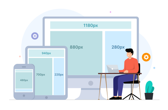
How Do You Find the Ideal Screen Size for Responsive Design?
To find the ideal screen size for responsive design, follow these steps:- Identify your target audience. What devices are they most likely to use? What are their screen sizes? You can use analytics tools to gather this information.
- Research popular screen resolutions. Once you know what devices your target audience uses, you can research the most popular screen resolutions. You can use websites like StatCounter and W3Schools to find this information.
- Choose a few key screen sizes to design for. You don’t need to design for every screen size, but choose a few key sizes that will cover most of your target audience. For example, you could design for mobile devices (375×667), tablets (768×1024), and desktop computers (1920×1080).
- Use fluid grids and flexible layouts. Fluid grids and flexible layouts allow your website to adapt to different screen sizes. This means that the content on your website will be displayed correctly regardless of the screen size it is being viewed.
- Test your website on different devices. Once you have designed your website, testing it on different devices is essential to ensure it looks good and functions correctly on all screen sizes.
Top 10 Most Common Screen Resolutions
Here are the top 10 most common screen resolutions: 1. 1920×1080 (Full HD) 2. 1366×768 3. 1280×1024 4. 1440×900 5. 1600×900 6. 1680×1050 7. 1280×800 8. 1024×768 9. 2560×1440 (QHD) 10. 3840×2160 (4K UHD) These resolutions represent the most widely used display settings across various devices, including desktop computers, laptops, smartphones, and tablets. Note: Web designers and developers must consider these resolutions when creating responsive and user-friendly websites to ensure optimal viewing experiences for all users.How to Do a Screen Resolution Test?
There are two main ways to do a screen resolution test: manually and automatically.Manual Screen Resolution Test
To do a manual screen resolution test, you will need to use a ruler or tape measure to measure the width and height of your screen in inches. Once you have these measurements, you can use the following formula to calculate your screen resolution:
Screen resolution = (width in inches) * (height in inches) * 72 pixels per inch
For example, if your screen is 15 inches wide and 10 inches high, your screen resolution would be 1080×720 pixels.
Now, you can run your tests on the screen resolution that needs to be tested. For this, you need to ensure you have the device that has the defined screen resolution.Automate Your Tests for Different Screen Resolutions with Testsigma
There are also many online tools that can automatically test your screen resolution. To use one of these tools, simply visit the website and follow the instructions. Let us see how we can do this in Testsigma. Step 1: Create your free Testsigma account and write a new test case. Step 2: Add some test steps and click on the Run button. Step 3: In the Ad-Hoc Run page, select screen resolution.Mobile Screen Resolution Stats Worldwide
The most common mobile screen resolution in 2023 was 360×800, with a market share of 11.02%. This is followed by 390×844 with 7.93% and 414×896 with 5.56%. It is important to note that these are just the most common mobile screen resolutions. Many other screen resolutions are in use, and the popularity of different screen resolutions can vary depending on the region. This chart shows the recent stats for mobile screen resolutions worldwide. (It will change in the future)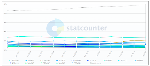
Desktop Screen Resolution Stats Worldwide
The most common desktop screen resolution 2023 was 1920×1080, with a market share of 22.18%. This is followed by 1366×768 with 14.02% and 1536×864 with 10.03%. It is important to note that these are just the most common desktop screen resolutions. Many other screen resolutions are in use, and the popularity of different screen resolutions can vary depending on the region. This chart shows the recent stats for desktop screen resolutions worldwide. (It will change in the future)Tablet Screen Resolution Stats Worldwide
The most common tablet screen resolution 2023 was 768×1024, with a market share of 24.92%. This is followed by 810×1080 with 10.22% and 1280×800 with 6.73%. It is important to note that these are just the most common tablet screen resolutions. Many other screen resolutions are in use, and the popularity of different screen resolutions can vary depending on the region and device. This chart shows the recent stats for Tablet screen resolutions worldwide. (It will change in the future)Desktop Vs Mobile Vs Tablet Worldwide
As you can see from the table, desktop computers have the widest range of screen resolutions, followed by mobile devices and tablets. This is due to many factors, including the different uses for each type of device, the size of the screens, and the cost of the devices.| Platform | Most Common Screen Resolutions | Percentage of Worldwide Market Share |
| Desktop | 1920×1080, 1366×768, 1536×864, 1280×720, 1440×900 | 44.95% |
| Mobile | 360×800, 390×844, 414×896, 375×667, 412×732 | 52.81% |
| Tablet | 768×1024, 810×1080, 1280×800, 1024×768, 1920×1080 | 1.83% |
- Desktop computers are used for a wider range of tasks than mobile devices or tablets, so they must support a broader range of screen resolutions. For example, desktops are often used for graphic design, video editing, and other creative tasks requiring high screen resolution.
- Mobile devices and tablets have smaller screens than desktop computers, so they need lower screen resolutions to ensure the text and images are readable.
- Mobile devices and tablets are less expensive than desktop computers, so manufacturers often use lower-resolution screens to keep costs down.
Why Website Dimensions Matter in Web Design and Development?
Website dimensions matter in web design and development because they affect the user experience. A website that is too wide or narrow can be challenging to navigate and read, while a website that is too tall or short can be frustrating for users to scroll through. Here are some specific ways website dimensions can impact web design and development:- Readability: Website dimensions can affect how easy it is for users to read the text on your website. A website that is too wide can make it difficult for users to read the text without having to scroll horizontally.
- Navigation: Website dimensions can also affect how easy it is for users to navigate your website. A website that is too narrow can make it difficult for users to click on the links and buttons on your website.
- Performance: Website dimensions can also affect the performance of your website. A website with many elements or a high-resolution image can take longer to load, especially on mobile devices.
- Design: Website dimensions can also affect the overall design of your website. A website that is too wide or too narrow can make your website look unprofessional.
How to Check Your Screen Resolution?
There are a few ways to check your screen resolution in Windows 10 and Mac, as it differs from device to device.How to Check and Change Resolution on Windows 10
- Right-click on the desktop and select “Display Settings.”
- Scroll to the “Resolution” section to see your screen resolution.
How to Check and Change Resolution on Mac
- Click on the Apple menu in the top left corner of the screen and select “System Preferences.”
- Click on the “Displays” icon.
- You will see your current screen resolution under the “Resolution” tab.
How to Change Your Screen Resolution
Changing your screen resolution can help improve the visual quality, adjust the display to your preferences, or resolve issues like blurry text. Here is how you can change your screen resolution across different devices and operating systems. 1) For Windows (PC)- Right-click on an empty area of your desktop.
- From the context menu, select Display settings.
- Scroll down to the Display resolution section.
- Use the drop-down menu to select your desired resolution and it will automatically be adjusted. Windows recommends resolutions based on your device.
- Click on the Apple menu at the top-left corner of the screen and select System Preferences.
- In the System Preferences window, click Displays.
- In the Display tab, you’ll see a section for Resolution.
- Select Scaled, and you’ll be given a list of available resolutions. Choose the one that fits your needs and it will automatically adjust the screen to the selected resolution.
- To enable Developer Options, go to Settings > About phone.
- Tap Build number 7 times to enable developer options. You should see a notification that says you are now a developer.
- To adjust the screen resolution from here, go to Settings > Developer options
- Look for options like Smallest width or Screen density to adjust resolution settings.
How to Decide Which Screen Resolution to Optimize Your Website for?
To decide which screen resolution to optimize your website, consider the following factors:- Target audience: What devices are your target users using? What are their screen resolutions? You can use analytics tools to gather this information.
- Content: What kind of content do you have on your website? You can optimize for a larger screen resolution if you have a lot of text or images.
- Purpose: What is the purpose of your website? If you want users to take a specific action, such as purchasing, you should optimize for a smaller screen resolution.
Takeaways on Website Dimensions
Remember these tips when you test:- The most common screen resolutions in 2023 were 1920×1080 for desktops, 360×800 for mobiles, and 768×1024 for tablets.
- It is important to consider the screen resolutions of your target audience when designing your website.
- You should also consider the type of content on your website and your website’s design when choosing which screen resolutions to optimize for.
- You don’t need to design for every screen resolution, but you should choose a few key sizes that will cover most of your target audience.
Frequently Asked Questions
Does Screen Size Affect Resolution?
Yes, screen size can affect resolution; larger screens may have higher resolutions for better clarity.How Can I Find out My Screen Resolution?
To find your screen resolution, right-click on your desktop (Windows) or go to System Preferences > Displays (Mac).What is My Screen Size in Pixels?
Screen resolution indicates how many pixels are displayed across the screen in both width and height. The resolution is typically expressed in the format width x height (e.g., 1920 x 1080), and the total number of pixels is the product of these two numbers. For instance, a 1920 x 1080 resolution means the screen displays 1,920 pixels horizontally and 1,080 pixels vertically, which gives a total of 2,073,600 pixels (1920 x 1080).What is the Highest Possible Screen Resolution?
As of today, 8K resolution (7680 x 4320 pixels) is the highest resolution commercially available for TVs and monitors, offering the most detailed viewing experience. However, 16K displays are under development and may become available. Responsive Website Design Testing ChecklistThe Ultimate Responsive Website Design Testing ChecklistMobile UI Testing
Mobile UI Testing – How to Perform with Testsigma?Mobile Responsive Testing
Mobile Responsive Testing – A Detailed Overview


