


There’s no denying that the world of mobile is constantly evolving, and smartphones have become an integral part of our lives. In today’s mobile-first world, users expect websites and applications to work smoothly on any device. So, it is essential to ensure that your application works on all device types, from smartphones to tablets. And that is where mobile responsive testing comes in.
In this blog, we will explore everything about responsive testing and how it affects the usability and performance of a website in terms of traffic. So let’s dive in.
Table Of Contents
- 1 What is Responsive Design?
- 2 What is Mobile Responsive Testing?
- 3 Why is Mobile Responsive Testing Critical for your Website?
- 4 Challenges in Mobile Responsive Testing
- 5 How to Initiate Mobile Responsive Testing?
- 6 Sample Test Cases for Mobile Responsiveness Testing
- 7 Different Types of Tools Available for Mobile Responsive Testing
- 8 Top 3 Tools for Mobile Responsiveness Testing
- 9 What Indicates that a Responsive Test is Successful?
- 10 Summary
- 11 Frequently Asked Questions
What is Responsive Design?
Responsive design is a design approach that allows websites and web applications to adapt to different screen sizes and device types. With responsive design, the layout, content, and functionality of a website can be optimized for various devices, including desktops, laptops, tablets, and smartphones.
If you’re still wondering what’s so fascinating about responsive design and why companies should adopt it, then you should be aware of the following facts,
- As per the latest reports, over 60.67% of all website traffic comes via mobile devices.
- According to reports from Google, about 63% of their US organic search traffic comes from mobile devices.
That is why making responsive web designs is more important these days. It can improve your website’s usability and traffic and provide a friendly user experience for mobile users. A website that doesn’t work well on a mobile device can lead to a poor user experience and a loss in traffic.
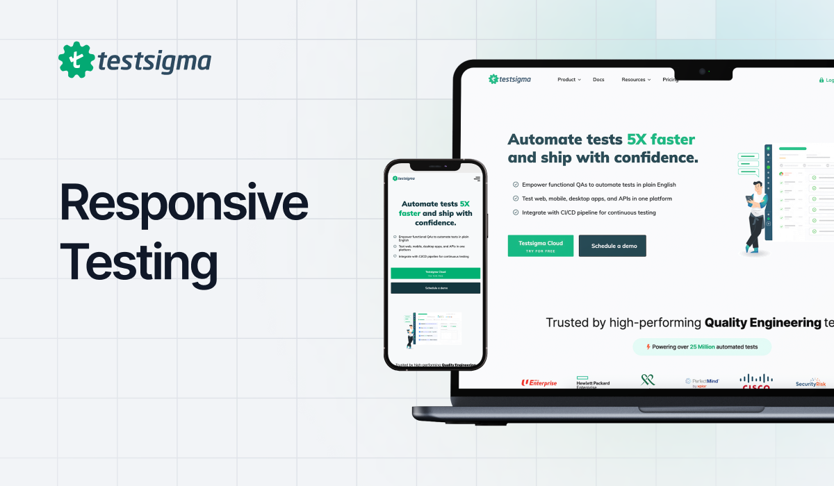
A responsive website design will adapt to any device, platform, and screen size. The below image is an example of such a design
What is Mobile Responsive Testing?
The digital world has significantly transformed how we interact with technology, with user interfaces being at the forefront of this change.
Statistics state that above 75% of people like to use a mobile-friendly site, and 96% of users have used sites that were not optimized for mobile devices. This is a major problem for any business that is looking to drive traffic and retain customers. That is where mobile responsive testing comes into play.
Mobile responsive testing is a testing process where QAs evaluate how a website or web application looks and works on different devices, such as smartphones and tablets. It helps ensure that the website is well-optimized and provides an optimal user experience across all devices, regardless of screen size, resolution, device type, or operating system.

Why is Mobile Responsive Testing Critical for Your Website?
Mobile responsive testing is not an optional testing phase that one can deprioritize or ignore if time doesn’t allow. Instead, it should be prioritized and a dedicated team should keep a watch on responsiveness issues for a better business. It was and still remains a critical aspect of the business where mobile-first design is often the primary design strategy focusing on smaller screen devices. This signifies in one way how important responsiveness testing is for businesses. Other important reasons can be assembled as follows:
- Manage the fragmentation: The mobile device world is highly fragmented today. Each manufacturer races towards designing and launching a unique mobile device for each user segment in multiple versions. Due to this, 1.6 billion mobile devices were shipped in 2024 alone. It is extremely hard to manage such high fragmentation for a tester as each new device launch means a new target device to attach for testing. Mobile responsiveness testing is a good way to manage this fragmentation often giving the facility to run parallel automation tests on multiple devices at once.
- Better user experience: Mobile responsiveness testing ensures that the elements not only scale down to the viewport size but change their shape and behavior according to the device. It fetches different elements on different devices and makes sure that the user faces minimum difficulties even if the network bandwidth is on the lower side. All these elements of mobile responsive testing work towards a single goal – enhancing the user experience. It helps in presenting the website in the best form depending on the device in use which also helps retain the user and spread a good word.
- Helps in SEO: Responsive websites are always preferred by search engines because they provide a better user experience. This preference results in higher rankings for the websites, especially those implementing robust technical SEO strategies, which provides greater visibility to businesses, the ultimate goal.
- Reduces costs: The testing team has to go through responsive testing if not today then tomorrow. A non-responsive website will always be reflected in the numbers, either cost or traffic. However, the more time the team takes, the more expensive this process will get, both to rewrite the code, fix bugs, and maintain the code for a better output. Therefore, mobile responsive testing will ensure that the app is always responsive and there are minimum bugs and issues post-production.
- Builds brand reputation: Finally, a responsive website translates to a better user experience which in turn translates to a better word of mouth and hence automatically builds a better brand reputation. A better brand reputation always attracts more users and ultimately, the business can generate maximum revenue.
Responsive testing is critical for businesses because if a website is not responsive, it will always be despised by the end-users and not many of them will return once their experience is not up to the standards. In a way, mobile responsive testing can be seen as a driving force that helps build businesses and lets the users experience the most out of the application.
Challenges in Mobile Responsive Testing
Simply implementing a responsive web design is not enough to ensure the success of a website. You must test the website or application on multiple devices to make sure it works as intended on all devices.
It includes testing all the website’s content, like font size, videos, navigation, links, images, and other web elements. Further, QA will have to test the application on different browsers, platforms, and screen sizes. That is because the website may appear different on Android than it may appear on iOS or Windows.
Testing the responsiveness of a website or application for mobile devices can be a challenging task. Some of the common challenges include the following,
- Wide range of mobile devices and tablets
- Multiple OS versions
- Screen size variations
- Cross-browser compatibility
Some of the other challenges faced by QA include identifying the right strategy, tools, the time required, etc.
How to Initiate Mobile Responsive Testing?
In order to initiate mobile responsive testing, you need to follow the below steps,
Testbed Creation
The first step is to create a testbed. A testbed is a test environment configured for performing tests. The testbed will include all the details like devices, browsers, versions, screen sizes, network configurations, operating systems, and other requirements that will be used for testing.
The testbed for a web application will look like this,
| Test Requirements | Web Server | Database | OS | Browser | Java version | Time required for setup | Time required for first test iteration |
| Testbed Combo 1 | IIS/Apache | MS SQL | Windows | Chrome/Edge/IE | version 6 | 1 hour | 2 hours |
| Testbed Combo 2 | IIS/Apache | MS SQL | Linux | Firefox | version 6 | 1 hour | 2 hours |
| Testbed Combo 3 | IIS/Apache | MS SQL | Mac | Safari | version 6 | 1 hour | 2 hours |
Time Required
It is crucial to discuss and decide the time required for the testing process, as responsive testing is a tedious and time-consuming task. Also, you must allocate adequate time for testing all the important testbed combinations.
The time required for each testbed will also be decided, as shown in the above samples. Also, it might vary for different combinations.
Real Devices and Emulators
Testing on real devices is critical to ensure that the website or application works correctly on different devices. But, it is not possible to use real devices for testing as it can be tedious, time-consuming, and expensive.
That is why using emulators and simulators can be a cost-effective alternative for testing. Also, you can opt for a cloud-based device lab with real devices. If you are automating your tests for responsive design, then Testsigma is one such tool for you.
What to Choose: Manual OR Automation?
Both manual and automated mobile responsive testing have their advantages and disadvantages. Manual testing allows testers to identify visual and functional issues that automated testing may not address. Automation testing can be faster and more efficient, but it may not be able to identify all types of issues. So, it is best advised to use a combination of manual and automation testing.
The best way is to automate the test cases that must be executed repeatedly. While the test cases that you might not run that often should not be. Of course, your exploratory testing would be done manually, and all testing would be done manually before your product becomes stable.
Prioritizing the Testing
It is not possible to test everything on a website or application at one time. That is when prioritization comes in. Prioritizing the tests helps make sure that the most critical features and functions are tested first. Also, this is very important when time and resources for testing are limited.
The priority should be to test the website on the most commonly used browsers, operating systems, versions, and screen sizes.
Appropriate priority should be assigned to all test cases. And test cases should be run according to the time available. High-priority test cases should always run first. High-priority test cases would be the ones that test critical functionalities and the ones that would be executed on the most commonly used browsers, devices, and platforms.
Using these factors, you can create a successful mobile responsive testing plan that assures your website or application provides a seamless user experience on all devices.
Sample Test Cases for Mobile Responsiveness Testing
Here are some of the sample test cases for mobile responsive testing,
- Check if the content fits the screen and is displayed correctly.
- Verify that all media, such as videos and audio, are accessible and works correctly on all devices.
- Check if the font color, size, and style remain the same.
- Verify if the links are working correctly and if they redirect the user to the right page.
- Check if the web page is not taking too much time to load.
- Check if different types of images, such as .png, .gif, or .jpg, are displayed as expected.
- Ensure navigating between web pages does not distort the content.
- Verify that the font size and style are consistent across all devices.
- Ensure all forms and input fields are easy to use and working as expected.
- Check that the website loads quickly and doesn’t have any performance issues.
Such test cases might be repeated for every device, and it is mostly automated for quick and efficient testing. And that is the best way to perform responsive testing.
Different Types of Tools Available for Mobile Responsive Testing
The tools available for responsiveness testing can be divided into categories below:
- Browser Developer Tools
- Emulators and Simulators
- Automated responsiveness testing tool
- Live interactive testing tool
1. Browser Developer Tools
Developer Tools are available on every browser, like Chrome and Firefox. Using this, you can manually test to see how your application might look on different devices. Simply right-click on the webpage, select “Inspect”, then select the Toggle device toolbar from the “Developer Tools”.
However, the challenge is that these tools only support limited devices by scaling up and down based on resolutions. You can not test your application on a wide range of devices and screen sizes. Also, you will have to test manually for all the scenarios. It is best suited for developers who run a quick check on their product.
2. Emulators and Simulators
The same responsiveness testing can also be done on emulators and simulators for different mobile devices. There are some tools that also offer these emulators on cloud. LambdaTest is one such tool.
3. Automated Responsiveness Testing Tool
Testsigma and SmartBear are great tools to automate responsiveness testing across a broad range of devices, screen resolutions, browsers, platforms, and versions. You can create and automate tests in the cloud without having to install any tools for testing purposes. Let’s discuss these tools in detail in the below sections.
4. Live Interactive Testing Tool
Tools like Browserstack offer live interactive testing. They host real devices on the cloud that you can use for testing your websites. You can use these tools to run quick tests to check the responsiveness of your applications. Let’s discuss this in detail below.
Top 3 Tools for Mobile Responsiveness Testing
There are several great tools available for mobile responsiveness testing, but here is a list of some of the top responsive design testing tools,
Testsigma
Testsigma is a powerful automation testing platform that lets you test web, mobile applications, and APIs in one place. You can easily automate test cases that are repetitive and consistent for most devices using Testsigma. This saves time, cost, and effort and makes the testing process 10x faster than manual testing.
You don’t have to write any complex code to write test scripts. Simply use the record and play feature and create test steps in plain English using the NLPs offered by the tool.

Top Features
- Run automated responsiveness testing in parallel on multiple devices in less time.
- Automate cross-browser testing quickly and effectively on multiple browsers, platforms, and versions.
- Testsigma supports 3000+ real devices, including mobile phones and tablets, and 1000+ browser and operating system combos.
- Extended 24×7 customer support via community, chat, phone calls, and email.
- Supports visual testing to help you identify the slightest defects in the design layout.

- Smoothly integrates with top CI/CD tools like CircleCI, Travis CI, and various other third-party applications.
- A freemium model, so you can pick the convenient pricing that best suits your business.
Price – Testsigma offers personalized pricing plans based on the unique needs of businesses – small to large. Check out the pricing plans here.
Free trial – You can also try Testsigma using the 21-day free trial.
BrowserStack
BrowserStack lets you test your website’s responsiveness on multiple platforms and real devices. Just enter your website URL in the specified space, and you’re ready to go.

Top Features
- It lets you easily test your website on 3000+ real devices and browsers.
- It offers a very simple and friendly user interface.
- Easily integrates with CI/CD tools
- Get your test results on Jenkins and Slack directly.
- It offers both live and automated website responsive testing.
Price – The pricing plan starts from $39 per month and goes up to $300 or more, depending on the team size and plan selection.
Free trial – Yes, available for free for a limited time interval.
BitBar
BitBar, developed by SmartBear, lets users run automated tests on multiple browsers and devices in parallel. You can now avoid the hassle of downloading multiple tools, as you can execute tests on the cloud with Bitbar.

Top Features
- It supports thousands of real devices and browsers for testing purposes. You can quickly test your websites on real smartphones and tablets instead of relying on emulators and simulators.
- Also, it fits perfectly in your CI/CD pipeline.
- Easily integrates with multiple third-party applications.
- Allows you to track network logs for performance.
- You can scroll and swipe on real devices.
Price – The price range starts from $39 and goes up to $177 per month on an annual basis. They offer custom pricing for enterprises.
Free trial – Yes, they offer a 14-day free trial.
What Indicates That a Responsive Test is Successful?
Like any other test, a responsive test can be deemed successful once all the criteria are met as the team decides. However, to generalize on the commonly set criteria, fulfilling the following can be linked to the success of a responsive test.
- Cross-browser consistency: The application behaves (functionally) consistently across all browsers and devices.
- Layout consistency: The application layout is consistent across the browsers and operating systems including animations and transitions.
- Performance consistency: The application shows consistent performance across all browsers and operating systems.
- Scalability: The elements are able to scale up or down depending on the device’s screen.
- Accessibility: The application meets all the standards of accessibility such as WCAG.
If a responsive test corresponds to any of the above parameters and can satisfy the requirements, it can be considered as successful.
Summary
Mobile responsive testing is a crucial step in ensuring that your website or application is optimized for mobile devices. Though it may seem like a time-consuming and challenging task, it will help improve the overall quality of your websites.
By providing a positive experience across different devices, businesses can attract more traffic, leading to improved engagement and conversions. So don’t overlook this in the development process, and ensure your website is truly mobile-responsive.
Frequently Asked Questions
Which Types of Tools Are Available for Responsiveness Testing?
The following are the types of tools available for responsiveness testing,
- Browser Developer Tools
- Emulators and Simulators
- Automated responsiveness testing tool
- Live interactive testing tool
How Can I Make My Mobile Website Responsive?
You can easily make your website responsive for mobile devices by using HTML and modern CSS layout techniques like media queries, flexbox, viewport, etc., in your website development process.
Once it’s developed, it is essential to test the responsiveness of your product. And the best way to ensure that your application provides a seamless user experience is to test it on real devices. You can do that manually using browser developer tools or via emulators and simulators; if you are doing this testing frequently, automating the tests would make sense; then you can use automation testing tools like Testsigma, which would then save the cost, time, and efforts required for testing.
Mobile UI TestingMobile UI Testing – How to Perform with Testsigma?Mobile Testing Tools (UAT) https://testsigma.com/mobile-testing-tools Test Cases for Mobile Application
Test Cases for Mobile Application & How to Use for TestingMobile App Testing Checklist
The Only Mobile App Testing Checklist That You’ll NeedMobile App API Testing
Mobile App API Testing | How to Use Testsigma For it?Mobile Testing Lab
Mobile Testing Lab: How to Decide Which Way to Go?

