


Welcome to Part 2 of UX & Testing: UX Lessons Learned From My Real-Life Experiences. Although it’s not a prerequisite, in case you missed part 1, you can read it here.
For a refresher, here is the recap of part 1.
User experience design is increasingly essential for businesses today. 70% of online businesses fail because of poor UX (Uxeria). Startups either lack the budget to recruit a UX team or underestimate its importance. Testers can fill a great deal of that gap. Testers can make an impact by helping their organization create a world-class UX to delight customers beyond their expectations.
My two-part article continues to explore some real-world examples of poor UX and how it affected me. Through these anecdotes, you will learn helpful UX concepts you can apply to your daily work, thus I also call them UX lessons.
Table Of Contents
- 1 STORY 1 – WHAT DID MY DAUGHTER TEACH ME ABOUT USER EXPERIENCE?
- 2 UX LESSON 1 – PREVENT USERS FROM MAKING COSTLY MISTAKES
- 3 STORY 2 – MY EXPERIENCES WITH A DIGITAL MENU
- 4 UX LESSON 2 – USEFULNESS (VALUE) > USABILITY (EASE OF USE)
- 5 UX LESSON 3 – DESIGN FOR EVERYONE (ACCESSIBLE DESIGN)
- 6 STORY 3 – MY CAR’S CONFUSING GEAR SHIFT INDICATOR
- 7 UX LESSON 4 – DESIGN FOR SAFETY
- 8 CONCLUSION
Story 1 – What Did My Daughter Teach Me about User Experience?

Managing your child’s screen time can be challenging in an age when screens are everywhere. My little daughter Sanvika is advancing from toddler to preschool years. During the COVID-19 pandemic, her screen time increased as she was bored at home. In addition, as working parents, my wife and I found it challenging to reduce Sanivka’s screen time. Sanvika liked watching rhymes and cartoons on the phone and television. To keep her busy, we started engaging her in various activities such as painting, drawing, music, craft, etc.
Nevertheless, we could not wholly prevent her from using my phone and tablet. We realized that we cannot completely stop her screen time at once but can only limit it. We planned to reduce her screen time day by day gradually.
Until then, I started thinking about the positive side: screen time can be beneficial if used to educate and develop a young child’s developing brain. Several games are designed to boost your child’s hand-eye coordination, logical thinking, and cognitive and motor skills. I installed a learning app for preschoolers that Sanvika could play and learn. This fun game taught her a little about letters, shapes, colors, numbers, animals, plants, etc.

Sanvika loved the learning app; she was challenged and learning. Very soon, she started getting bored of playing the same game repeatedly. For her screen time to be educational, I had to install several similar games.
Today you can make in-app purchases with a simple button on your phone through various payment methods. I was shocked when I checked my credit card statement; I found some charges for in-app purchases from the learning apps. The costs I incurred were minimal(less than 5$), but I realized I need to be more careful to avoid severe losses in the future. Many cases have been reported where kids have spent a lot on in-app purchases.
Setting appropriate restrictions and parental controls on devices can help you halt kids from shopping online without your knowledge. However, these businesses also have the equal responsibility of preventing such disasters. Design with responsibility should be the mantra when building apps for children.


UX Lesson 1 – Prevent Users From Making Costly Mistakes
My daughter taught me a valuable UX lesson: A good UX prevents users from making costly mistakes. Jakob Nielsen’s 5th usability heuristic talks about preventing errors. Good error messages are essential, but the best designs carefully prevent problems from occurring in the first place. Children are unaware of the consequences of some actions. Children are barely able to tell the difference between authentic content and promotion. Thoughtful designs have an error-proofing mechanism(childproofing in this case) to prevent toddlers from making in-app purchases. In the pictures below, you can see how applications prevent toddlers from making purchases with error-proofing.
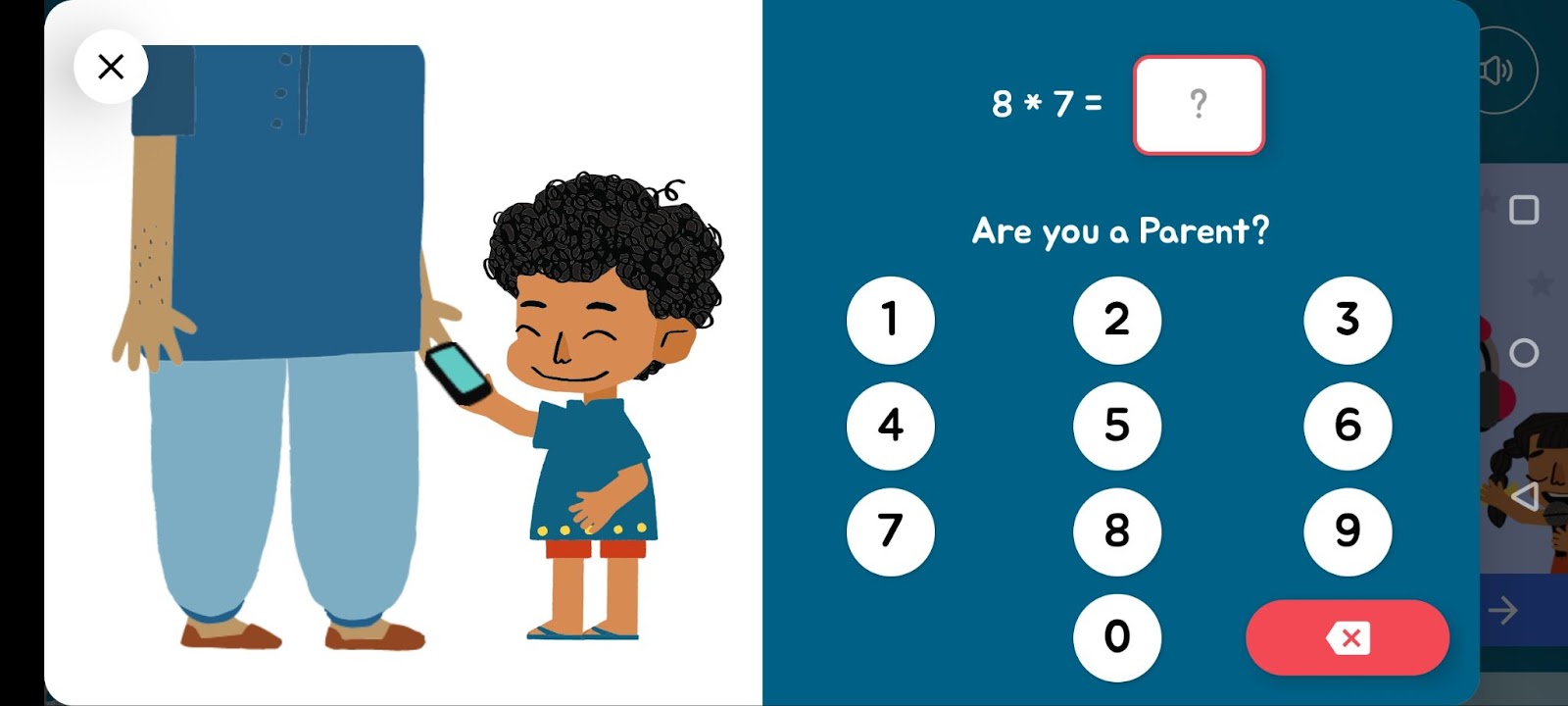
Despite their simplicity, these designs work well. Toddlers have less-developed logical skills and rely on visuals for their selection. These designs save customers from getting a surprise.
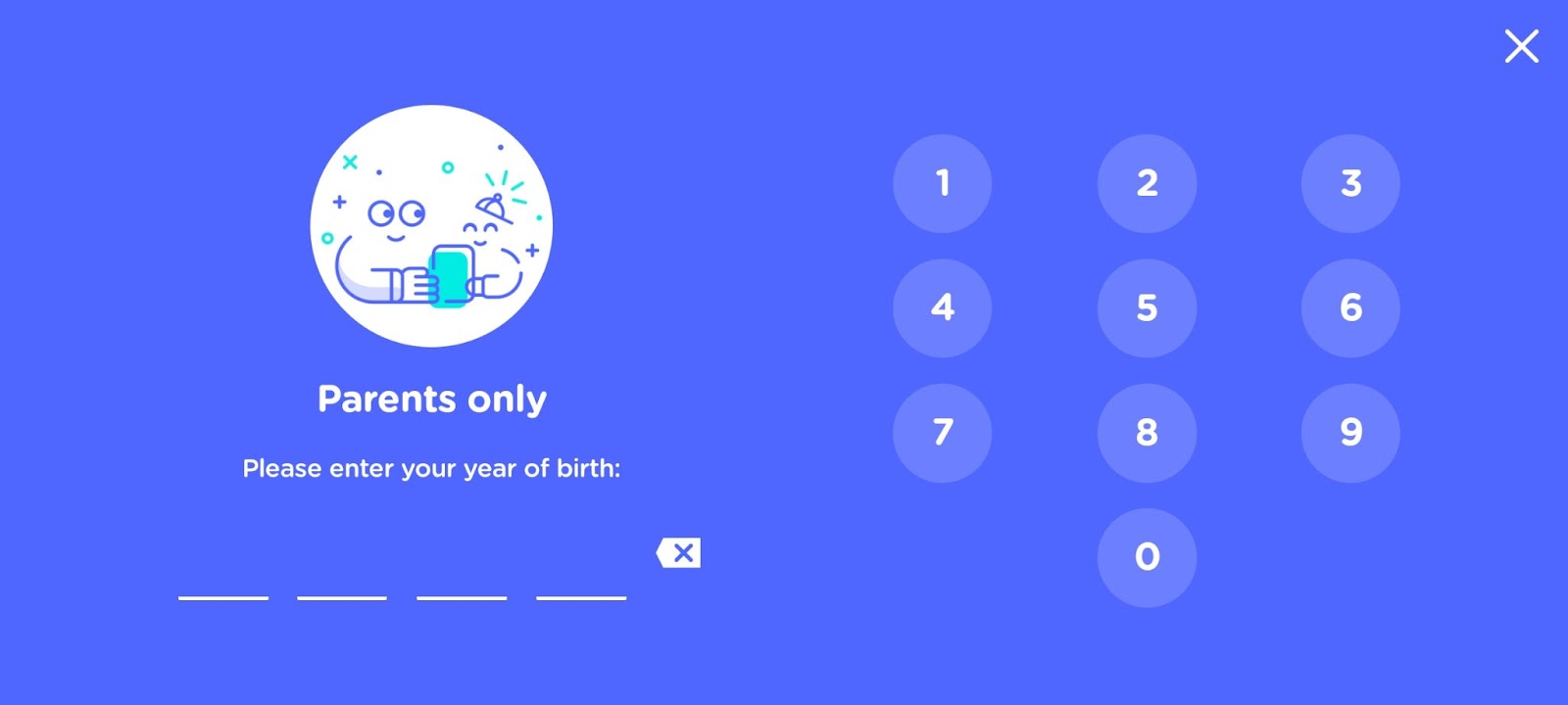
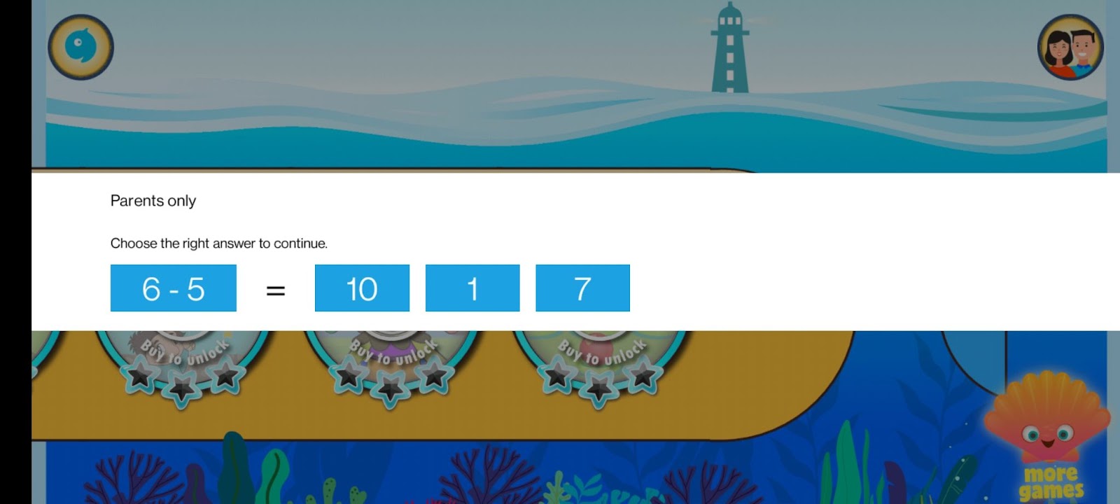
Some fraudulent apps trick young users into making purchases or installing additional apps. Intentionally, they do not have preventative mechanisms in place. Although some apps have good intentions but fail to build a good error-proofing design. Toddlers can be more intelligent than you think. A poorly designed error-proofing mechanism could still allow them to make purchases. Look at the example below:
Toddlers bypass this one through trial and error.
It is common for toddlers to perform all sorts of gestures when confused, including swiping down.
People make mistakes. Even though actions may be unintentional, they can cause severe damage to the users and also the reputation of your business. As a tester, you should use your influence to persuade your team to implement error-proofing mechanisms for high-risk features.
Story 2 – My Experiences with a Digital Menu
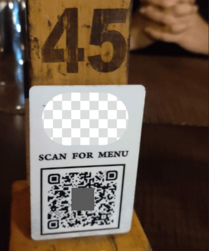
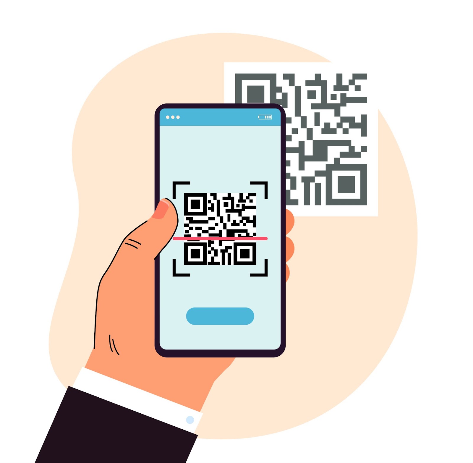
In the days following the decline in COVID cases in Bangalore, my wife and I visited a restaurant. We were asked to scan a QR code when asked for the food menu. Just about every fancy restaurant in Bengaluru has a digital menu these days. Customers scan a QR code to access the food or drinks menu. During the pandemic, restaurants started adopting digital menus as they offered contact-free ordering by eliminating the need for handing anyone a physical menu. By doing so, customers could order directly without waiting for a server.
In addition, a digital menu does not require reprinting when updated. Restaurants hoped to enhance dining experiences through digital menus by reducing customer waiting times. Furthermore, they thought more orders could be taken with fewer staff, which benefits the business. To expedite the transition to digital menus, utilizing a QR code generator can simplify the process of creating and managing QR codes for menu access.
The battery on my phone was dead that day, and my wife did not carry her phone with her. Because the restaurant did not have any physical menu, there was no other way for us to order. It was pretty awkward; we borrowed one of the staff’s mobile phones to access the menu. His data pack had expired; digital menus can only be accessed via the internet. I borrowed a phone from the person next to me so I could access the menu. A simple task became a hassle.
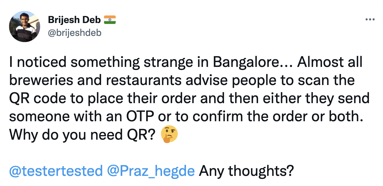
As far as digital menus are concerned, I have not had a good experience with them. Digital menus are supposed to make it easier for restaurants to take orders and deliver food faster. Recently, I met Brijesh Deb at a renowned brewery in Bangalore. We could not access the menu because it needed an OTP to be entered to get started. We had to wait for the staff to share an OTP to access the digital menu. It took them around 20 minutes to share OTP and place our order.
In these cases, did the digital menu accomplish its goals?
- Is the digital menu meeting the goal of contact-free ordering?
- Is the digital menu meet the goal of improved dining experience?
- Is the digital menu reducing wait time and speeding up the ordering and delivery of food at restaurants?
- Does the digital menu reduce the number of workers?
UX Lesson 2 – Usefulness (Value) > Usability (ease of Use)
In simple terms, usability is ease of use. It answers the question, “How easily can a user complete the desired task with your product”?
A product is useful when it can be used to accomplish a specific goal or get closer to them. It answers the question, “How helpful your idea/solution/product is to your user?”
It doesn’t matter how usable your app is if it isn’t meeting your user’s needs. Your product cannot be successful unless users find it valuable or helpful, no matter how easy it is to use. Aim to deliver valuable products. Users will not accept anything that is not useful. Your target customers need a highly useful app. It is their number one priority. As a tester, validate whether your software solves the problem it was built for. Usability is essential, but usefulness is arguably more important.
UX Lesson 3 – Design for Everyone (accessible Design)

- Would your parents or grandparents be able to scan the QR code to access the digital menu?
- Would they be able to order their favorite food through their devices and place an order?
I have noticed that elderly people find it difficult to order from a digital menu. They may not be as tech-savvy as their younger counterparts. It is common for apps to be designed for younger generations and to ignore the needs of seniors and people with disabilities. This target group may have hearing, motor, visual, speech, and cognitive limitations, which limit them from using products. Additionally, for elders, getting used to new applications or completing tasks may take longer.
Internet access is widespread among the elderly, and many products cater to their needs. The elderly are also trying to learn new-age technologies. Digital technology will become more prevalent among the elderly in the near future. Diverse audiences will be discouraged by an inaccessible design. A good design makes a product accessible to anyone regardless of age or permanent, temporary, or situational disability.
- It may be necessary to install a QR scanner on some devices as they do not come with one by default. Many users are unable to find one even though they have it on their device. This can make QR scanners inaccessible for such users.
- Many elders have difficulty searching, navigating, and ordering items from digital menus.
- The fonts on digital menus are small, making them difficult to read on mobile devices.
Elders/Differently abled may seek assistance from the staff to place an order, but the benefit of the digital menu is lost once again. Design a great user experience for seniors based on their needs and capabilities.
- The bigger, the better when it comes to designing for the elderly. Keep text and button sizes large.
- You should use font sizes greater than 16 px and let users adjust the text size as per their need by zooming in/out.
- Make your pages easier to read by including some white space between elements. Place buttons and icons with a minimum spacing of 44 pixels to reduce accidental taps.
- Pay attention to the contrast ratio. A contrast ratio of 4.5:1 should suffice, although 7.0:1 would be ideal.
- Keep your app design simple and clear. Make it logical and easy to navigate.
- Most importantly, perform a usability test, don’t rely on your assumptions, recruit some elderly participants and get feedback on your design.
Story 3 – My Car’s Confusing Gear Shift Indicator
The majority of new drivers in India start out with a manual transmission. I was no exception. In the beginning, I wasn’t comfortable behind the wheel of an automatic car since I was used to a manual transmission. Driving a modern car is a completely different experience.
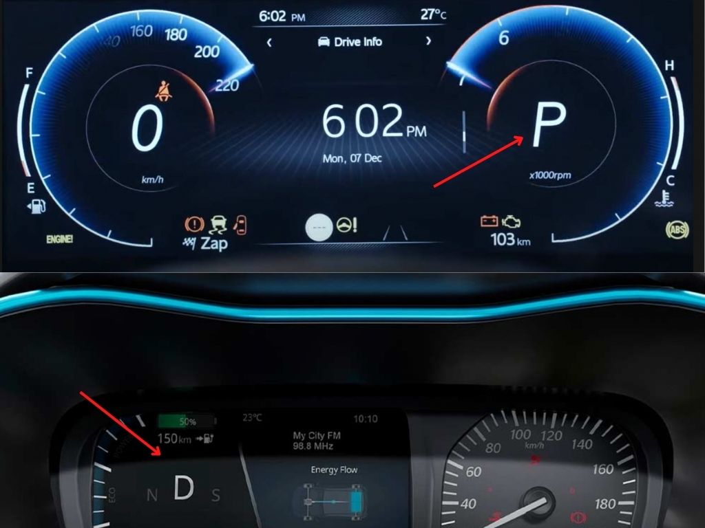
When I switched to a new automatic car, I found the gear shift indicator on the dashboard slightly confusing. As you can see in the picture below, the current gear you are in (i.e., P) is highlighted and is slightly larger. But the difference is not significant. To add to the confusion, Reverse(R) is always shown in red, which I initially found confusing. I thought the current gear was shown in Red. I took some time to get used to this design. It can be dangerous because the new driver may be misled about the gear they are currently engaged in because of this confusing design.

In several other cars, gear shift indicators on the dashboard are designed better. A good design places a significant amount of on indicating the current gear the user has engaged.
BAD UX CAN KILL

Anton Yelchin was suspected to be killed by his own car(Jeep Cherokee) in his driveway. His car apparently rolled back down Yelchin’s steep driveway when he got out to check the locked gate. The driver did not get feedback when engaging the gear lever in vehicles equipped with Monostable electronic gearshifts.
The lever always remained in the center for any gear you engage (unlike the traditional gear system). The current gear was illuminated(which is hardly visible in sunlight) on the gear lever. The same was also displayed on the car’s dashboard.
Drivers often felt they had pushed the gear shift all the way forward to the Park(P) position. However, the difference between Reverse(R) and Park(P) was incredibly subtle. It was hard for the driver to determine whether the vehicle was in ‘Park’[P] or still in Reverse[R]. Many drivers reportedly exited their cars in Reverse[R] mode or even Neutral[N] instead of Park[P] mode.
As a result, the car would roll away. This poorly designed monostable shifter was responsible for at least 306 cases of vehicle rollaway, 117 crashes, 38 injuries, and one death. FCA had to recall 1.1 million vehicles equipped with the monostable gearshift.
UX Lesson 4 – Design for Safety
When designing interfaces for automobiles, safety should be the top priority. Modern cars are powerful computers where software plays a significant role. There has been a gradual shift toward screen-based interfaces in cars. The advanced infotainment systems in cars today combine entertainment and information for an enhanced in-vehicle experience. Due to the number of available features, infotainment has also become a safety concern. Poorly designed infotainment systems can cause serious problems.
Researchers found that drivers distracted by infotainment systems spend a long time setting up navigation systems. Even the simplest of functions, like changing a song, may require the driver to take their eyes off the road to tap the button on the screen, which can distract the driver’s attention. On the road or in the car, distracted drivers can endanger their lives and the lives of others.
- To drive safely, drivers should keep their hands on the wheel as much as possible. Ensure that none of the on-screen interactions require drivers to remove both hands from the steering wheel. Ensure your interfaces supports the one-hand operations/gestures. Enable drivers with steering wheel controls and voice commands for improved driving safety.
- Driving-related information should be presented in a simple and easily understandable manner. Driving and safety information (such as speedometers, gear indicators, navigation, etc.) should be prioritized over non-driving information like media.
- Infotainment systems can overwhelm users with too much information, leading to distraction or confusion. Go for the minimalistic design – enable drivers to grasp all the content within two seconds and return their attention to the road. Keep the driver’s attention on driving and discourage distractions.
- Automobile manufacturers should apply usability principles when designing the User Experience for drivers. Learn more here.
BONUS
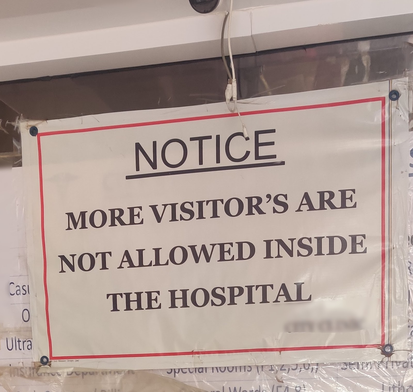
The reason I don’t go to the hospital 🙂
Is there anything else you would want me to know?
Help users identify and recover from errors. It is important that error messages describe the problem clearly and suggest a constructive solution in plain language.
Conclusion
As testers, we are all responsible for ensuring that the products we work on offer the best user experience. A good user experience(UX) is not only about beautiful interfaces.
- Understand your users and their problems, and help your teams build a useful product that adds value to your users.
- Anticipate mistakes your users could make with your product and safeguard them with error-proofing mechanisms.
- Take into account the needs of users likely to experience exclusion and develop features that enable them.
- Safety comes first. You save money, reputation, and sometimes lives by good design. Work with your team, eliminate or reduce foreseeable design risks.
Do share your experiences with poor design and how it impacted you. Thank you for reading the article. I hope that you found it helpful and learned something new from it. Personally, I enjoyed writing this series.
Do you think there should be a part 3 for this article? Let me know in the comment section below.
Beginners and experts alike will enjoy using Testsigma’s best-in-class user experience. Give it a try!
PC: Freepik

