- Results & Reports
 Test Plan Run Results
- Filters on Run Results
- Custom PDF Report Generation
- Custom Allure Reports Generation
- Custom JUnit Report Generation
- Dashboard
Widgets Reference
This reference lists all widgets available in Custom Dashboards and describes what each widget displays and how to interpret it.
Each widget includes the following fields:
- Widget: The name of the widget
- Description: What data the widget displays
- Use case: When and why to use the widget
- Interpretation: How to read and act on the data shown
Use this reference when selecting widgets for a dashboard or when reviewing dashboard data.
Widgets are grouped into categories based on their purpose to make navigation easier. For steps to add widgets to a dashboard, see Manage Custom Dashboard.
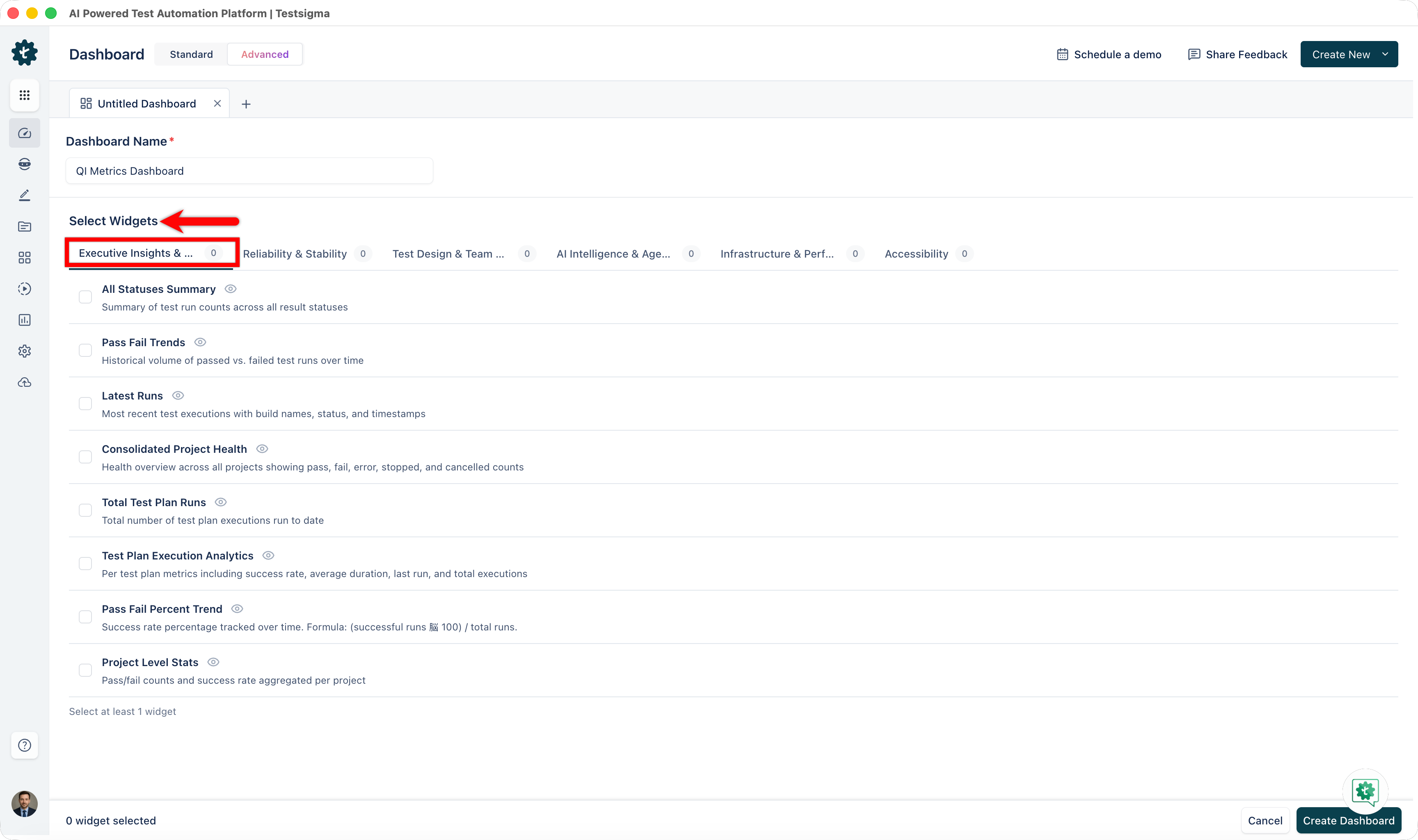
Executive Insights & Release Readiness
| Widget | Description | Use Case | Interpretation |
|---|---|---|---|
| All Statuses Summary | Summary of test run counts across all result statuses: Passed, Failed, Error, Stopped, Cancelled | Get an instant overview of test execution health at a glance | High Passed count with low Failed count indicates good health. High Error count suggests infrastructure issues. |
| Pass Fail Trends | Historical volume of passed versus failed test runs over time. | Track quality trends and detect regressions during release cycles | Rising failed tests indicate quality decline. Upward trend shows improving quality. Flat pattern indicates stability. |
| Latest Runs | Most recent test executions with build numbers, timestamps, and status. Real-time updates as executions complete. | Monitor ongoing test execution and verify CI/CD pipeline activity | Frequent recent entries show active automation. Gaps in timestamps may indicate pipeline delays or infrastructure issues. |
| Consolidated Project Health | Aggregate health view showing pass, fail, error, stopped, and cancelled counts across all projects | Compare test health across your entire product portfolio in one view | High pass percentage indicates overall portfolio health. Identify which projects have high failure rates for targeted improvement. |
| Total Test Plan Runs | Cumulative count of all test plan executions in the date range. Large number KPI tile. | Measure testing volume and track execution frequency over time | Higher numbers show greater test coverage. Compare across periods to see whether testing intensity is increasing. |
| Test Plan Execution Analytics | Per test plan metrics: success rate, average duration, last run, and total executions. Sortable data table. | Identify slow test plans and understand which plans run reliably | Low success rates indicate flakiness. High durations reveal performance bottlenecks. Sort by duration to find slowest plans. |
| Pass Fail Percent Trend | Success rate percentage tracked over rolling time intervals. Formula: (successful runs ÷ total runs) × 100 | Monitor whether test suite health is improving, stable, or declining | Upward line shows quality improvement. Downward line indicates regression. Flat line shows consistent maturity level. |
| Project Level Stats | Pass/fail counts and success rate aggregated by project | Quickly compare test health across different projects | Each project card shows overall health. Compare across cards to identify problem areas needing attention. |
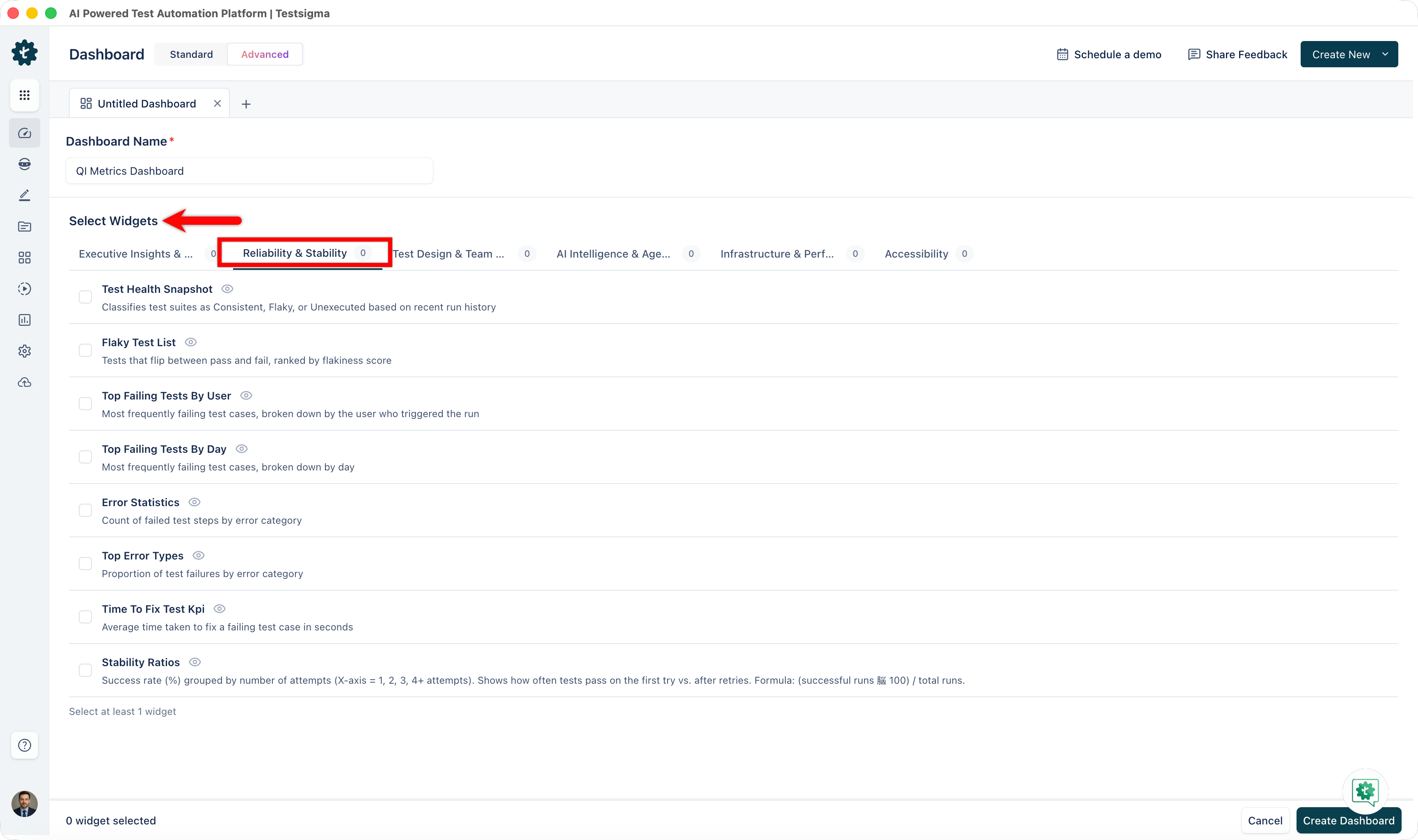
Reliability & Stability
| Widget | Description | Use Case | Interpretation |
|---|---|---|---|
| Test Health Snapshot | Test suite classification: Consistent, Flaky, or Unexecuted (based on recent run history). Donut chart with percentages. | Quickly assess overall test suite stability at a glance | High Consistent percentage (ideal > 80%) shows a healthy suite. Large Flaky percentage signals stability work needed. High Unexecution may indicate coverage gaps. |
| Flaky Test List | Tests that flip-flop between pass and fail without code changes, ranked by Flake Score (higher score = more flaky) | Target high-impact flaky tests for stabilization and root cause analysis | Tests at top are most problematic. High flake scores indicate timing or resource-dependent issues. Start stabilization efforts with highest-scoring tests. |
| Top Failing Tests By User | Most frequently failing tests, segmented by the user who triggered the run | Identify which tests fail most and understand patterns by execution source | Failures consistent across users indicate real product defects. Failures only under specific users may indicate environment or data issues. |
| Top Failing Tests By Day | Most frequently failing tests, segmented by day of occurrence | Identify day-specific failure patterns | Failures concentrated on certain days may indicate scheduled maintenance, batch jobs, or data refresh cycles affecting tests. |
| Error Statistics | Count of test executions by error type: Idle Timeout, Network Error, Session Timeout, Device Not Available, etc. | Spot systemic infrastructure or environment issues causing failures | High Device Not Available suggests saturation. Network Errors indicate connectivity problems. Coordinate with infrastructure teams to resolve. |
| Top Error Types | Proportional breakdown of error type distribution | Understand the dominant failure mode and allocate investigation resources | The largest slice shows the most frequent error. If one type dominates, focus remediation there. Multiple similar sizes suggest distributed issues. |
| Time To Fix Test KPI | Average duration from first failure of a test to its successful resolution (in seconds) | Measure your team's efficiency in diagnosing and fixing test failures | Lower times indicate fast response. High times suggest slow root cause identification. Track trend to measure team improvement. |
| Stability Ratios | Success rate (%) grouped by number of attempts (1, 2, 3, 4+ attempts). Formula: (successful runs ÷ total runs) × 100 | Understand how often tests pass on first try versus requiring retries | High 1st attempt success is ideal. If success improves on 2nd+ attempts, tests are flaky. Consistent success shows robust tests. |
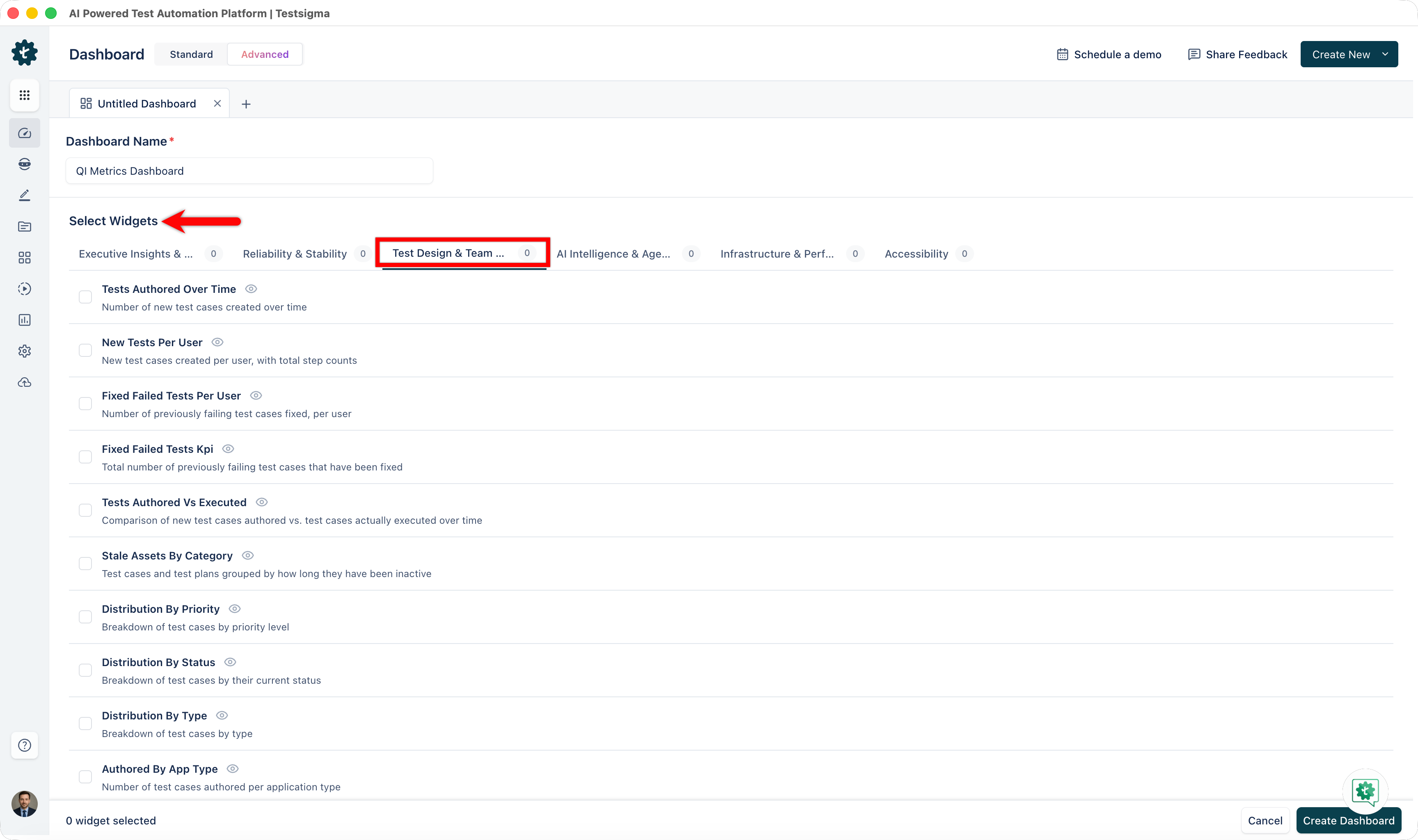
Test Design & Team Productivity
| Widget | Description | Use Case | Interpretation |
|---|---|---|---|
| Tests Authored Over Time | Number of new test cases created in each time interval. Column chart. | Monitor test creation pace and ensure healthy coverage growth | Rising columns show increasing test creation. Flat or declining columns may indicate saturation or resource constraints. |
| New Tests Per User | New test cases created per team member, with step count. Leaderboard or bar chart. | Recognize high contributors and identify team participation gaps | High contributors drive coverage. Use to celebrate performance. Low contributors may need support or training. |
| Fixed Failed Tests Per User | Number of previously failing tests successfully fixed by each user | Credit test maintenance work and identify quality improvement drivers | High fixers are maintaining test health. If fixes are low team-wide, flaky tests may be accumulating. |
| Fixed Failed Tests KPI | Total count of previously failing test cases that have been fixed | Measure overall test stabilization progress | Rising numbers indicate successful stabilization efforts. Compare periods to track team maintenance effectiveness. |
| Tests Authored Vs Executed | Dual-axis comparison: tests created versus tests actually run. Dual-axis bar and line chart. | Detect inactive test cases and gaps between authoring and execution | If authored >> executed, inactive tests exist. Narrow gap shows healthy execution. Large gap signals stale tests. |
| Stale Assets By Category | Test cases and test plans grouped by inactivity duration | Identify orphaned tests and decide whether to maintain or archive | Large stale percentages indicate unused tests. Review why they stopped executing. Delete unused tests to reduce maintenance burden. |
| Distribution By Priority / Status / Type | Breakdown of test cases by priority level, current status, or test type | Understand test portfolio composition and ensure balanced coverage | Even distribution shows balanced coverage. Skewed distribution may indicate concentration. Adjust composition to match risk profile. |
| Authored By App Type | Number of test cases authored for each application type: Web, Mobile, API, SAP, and others | Verify balanced coverage across your platform portfolio | Similar bar heights show balanced effort. Large imbalances indicate heavy investment in some platforms with gaps in others. |
| Test Cases Submitted/Assigned For Review | Submitted: test cases you created awaiting review. Assigned: test cases assigned to you pending your review. | Track code review bottlenecks and manage QA approval workflows | High pending counts indicate review backlog. Low counts show smooth approval flow. Monitor to ensure timely review cycles. |
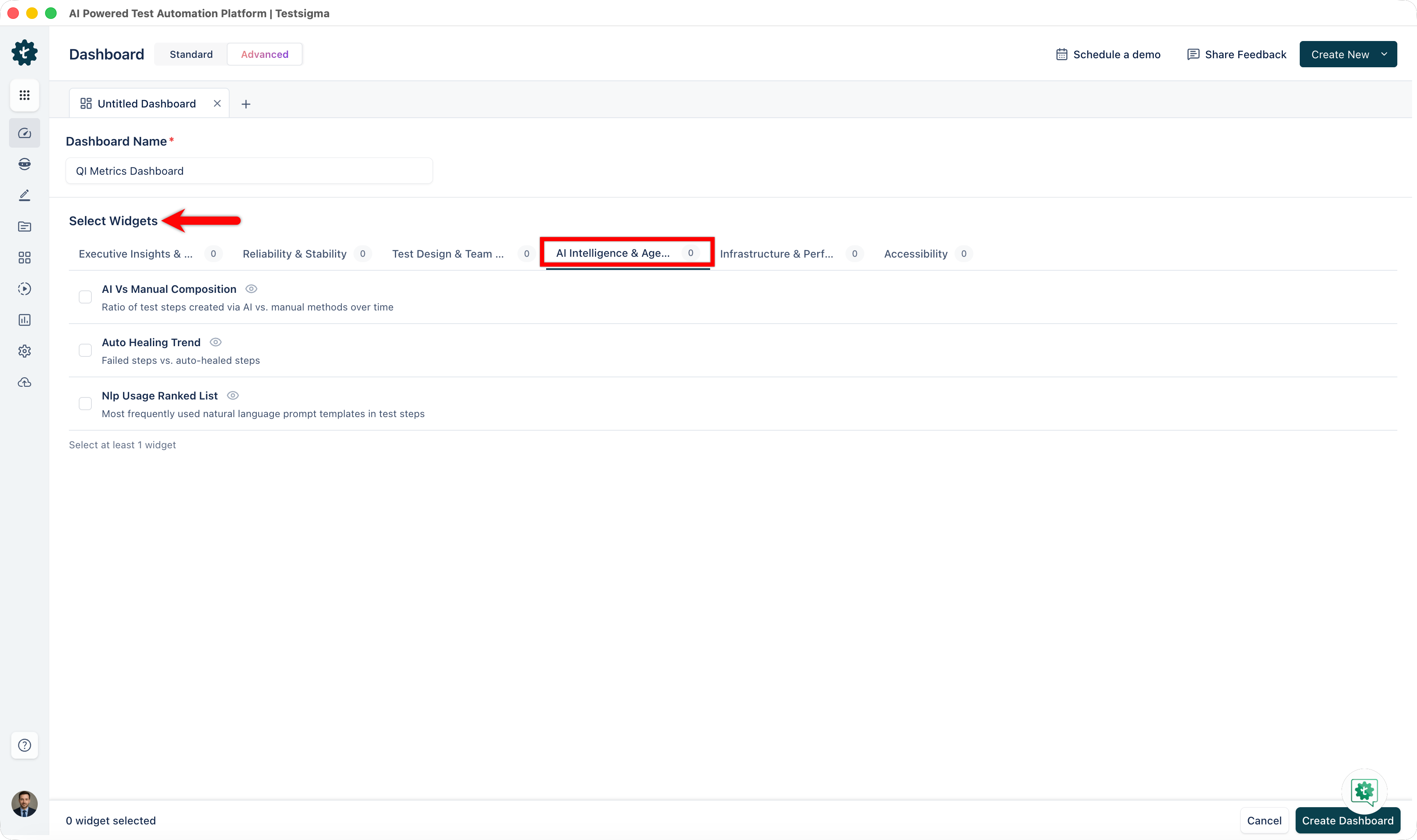
AI Intelligence & Agentic ROI
| Widget | Description | Use Case | Interpretation |
|---|---|---|---|
| AI Vs Manual Composition | Ratio of test steps created via AI versus manual recording/typing. 100% stacked bar chart. | Quantify AI adoption and measure shift from manual to AI-assisted authoring | Growing AI percentage shows adoption momentum. Target: increase AI composition month-over-month to show adoption velocity. |
| Auto Healing Trend | Failed steps vs. auto-healed steps over time | Demonstrate cost savings from AI-driven locator and image updates | High healing numbers show significant automation saving. Each healed test = manual effort avoided. Rising trend justifies continued AI investment. |
| NLP Usage Ranked List | Most frequently used natural language prompt templates in test step creation | Understand which AI capabilities teams leverage most and where training is needed | Top prompts show popular features. Low-usage prompts identify underutilized capabilities. Target training on low-use features. |
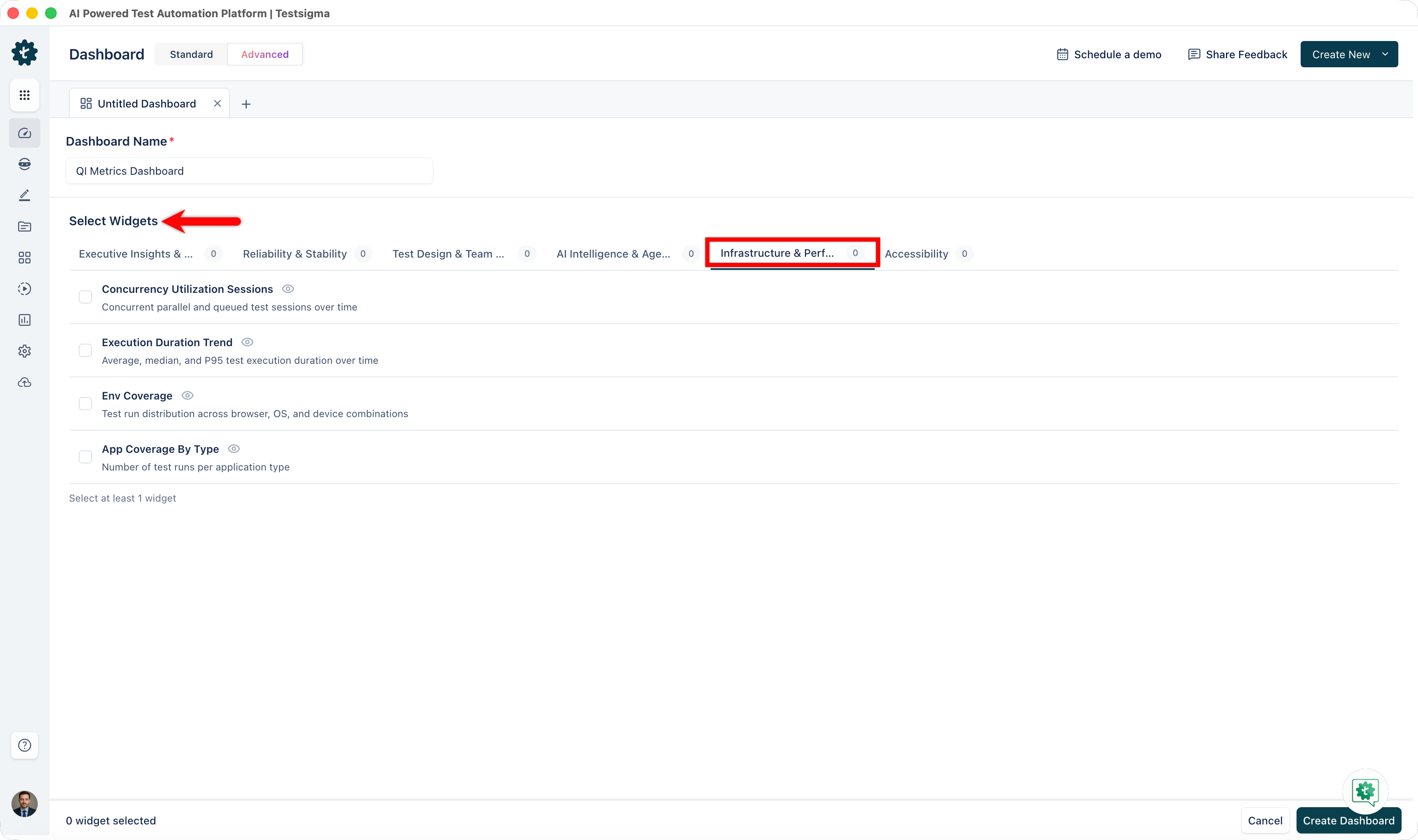
Infrastructure & Performance
| Widget | Description | Use Case | Interpretation |
|---|---|---|---|
| Concurrency Utilization Sessions | Concurrent parallel sessions in use versus the configured limit. Overlapping area chart. | Identify whether concurrency is underutilized or bottlenecked | Gap between used and limit shows unused capacity. Using near limit constantly suggests saturation. Plan expansion based on peak usage. |
| Execution Duration Trend | Average, median, and p95 test execution duration over time. Line chart with trend lines. | Detect slow test runs and performance regressions | Rising trend indicates slowing execution. Sudden spikes signal performance regression. Investigate prolonged runs to find bottlenecks. |
| Environment Coverage | Test run distribution by browser type, OS version, and mobile device model. Tree map or nested chart. | Ensure balanced testing across supported platforms and identify coverage gaps | Balanced boxes show even coverage. Large dominance by one environment may leave others undertested. Match coverage to customer distribution. |
| App Coverage By Type | Number of test runs per application type. Donut or pie chart. | Verify testing effort is proportional across your app portfolio | Similar slices show balanced effort. Large imbalance means some apps receive less testing. Adjust allocation to match risk profiles. |
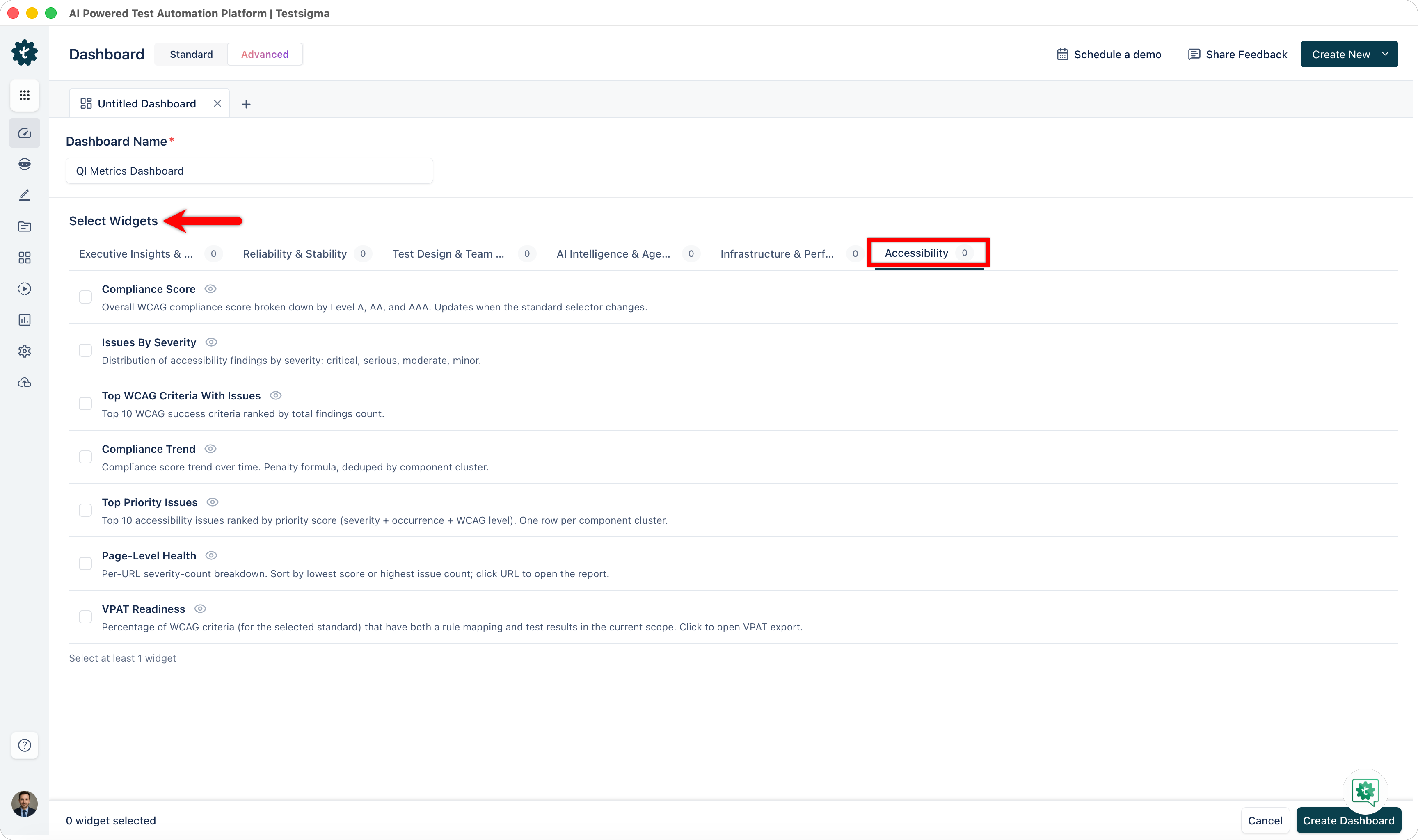
Accessibility
The Accessibility category contains widgets that surface compliance scores, issue distribution, and remediation status across your application. All widgets support the Standard Selector dropdown, which maps your test data to your chosen accessibility standard without requiring new test runs.
Select your standard from the Standard Selector at the top of the dashboard. The following standards are available: WCAG 2.2, ADA, Section 508, EAA, and EN 301 549. The default is WCAG 2.2 AA and persists per application.
| Widget | Description | Use Case | Interpretation |
|---|---|---|---|
| Compliance Score | Donut chart showing the overall accessibility compliance score for the selected standard. Breaks down conformance by level: A, AA, and AAA. | Get a quick read on how close your application is to full compliance before a release or audit. | A high overall score with strong AA coverage indicates good compliance posture. Low A-level scores suggest critical gaps that block basic accessibility requirements. |
| Issues by Severity | Donut chart showing open accessibility issues distributed by severity: Critical, Serious, Moderate, Minor, and Success. | Prioritize your remediation backlog by identifying where the most severe issues are concentrated. | A large Critical or Serious slice requires immediate attention. Moderate and Minor issues can be planned into upcoming sprints. Success items confirm passing checks. |
| Issues by WCAG Criterion | Horizontal bar chart of the top 10 WCAG criteria ranked by issue count. | Identify which accessibility rules your application fails most frequently so you can focus remediation where it has the most impact. | The longest bars represent the highest-volume failure points. Address the top two or three criteria first to reduce overall issue count rapidly. |
| Trend Over Time | Line chart tracking your compliance score across test runs or dates. | Measure whether accessibility is improving or regressing across release cycles or after a dedicated remediation sprint. | An upward trend confirms remediation efforts are working. A flat line indicates no progress. A downward trend signals new issues are being introduced faster than they are fixed. |
| Top Issues | Table listing the most impactful open accessibility issues. Each row shows the WCAG criterion, severity, pages affected, and an AI badge if Atto has a fix suggestion available. | Quickly identify which specific issues affect the most pages and where AI-assisted remediation is available. | Issues affecting many pages should be prioritized — fixing them reduces your overall issue count most efficiently. Items with an AI badge can be resolved faster using Atto's suggested fix. |
| Page-Level Health | Per-URL accessibility score with a severity badge breakdown for each scanned page. | Identify which individual pages need the most attention and track page-specific compliance over time. | Pages with low scores or a high proportion of Critical badges are the highest remediation priority. Compare across releases to confirm page-level improvements. |
| VPAT Readiness | Percentage of WCAG criteria that have both a rule mapping and test results — your readiness indicator for a VPAT submission. Click the widget to open the VPAT export dialog. | Understand how much of the WCAG criteria surface is covered before initiating a VPAT audit or responding to a customer accessibility request. | A high percentage means most criteria have been tested and documented. Gaps indicate criteria with no rule coverage or no test results — address these before submitting a VPAT. |
| Remediation Progress | Stacked bar chart showing issues found versus issues fixed, grouped by week. | Track whether your team is resolving accessibility issues faster than new ones are introduced. | Weeks where fixed bars exceed found bars indicate net progress. Weeks where found bars exceed fixed bars indicate accumulating debt. A converging trend confirms the backlog is shrinking. |
Quick Dashboard Templates
Use these recommended widget combinations as starting points when creating a new dashboard.
Release Readiness Dashboard
- All Statuses Summary
- Pass Fail Trends
- Latest Runs
- Consolidated Project Health
Quality Improvement Dashboard
- Flaky Test List
- Top Failing Tests By User
- Error Statistics
- Time To Fix Test KPI
Team Productivity Dashboard
- Tests Authored Over Time
- New Tests Per User
- Fixed Failed Tests Per User
- Stale Assets By Category
AI Investment Dashboard
- AI Vs Manual Composition
- Auto Healing Trend
- NLP Usage Ranked List
Infrastructure Planning Dashboard
- Concurrency Utilization Sessions
- Execution Duration Trend
- Environment Coverage
- App Coverage By Type
Accessibility Compliance Dashboard
- Compliance Score
- Issues by Severity
- Trend Over Time
- Remediation Progress
Want to contribute or report missing content?