
If you’ve ever pushed a website live only to find it looks perfect on desktop but completely breaks on mobile, you know the struggle. That’s where responsive testing tools step in. For testers and developers, the biggest pain points are endless device variations, inconsistent layouts, and time wasted juggling between screens.
The right tools make it easier to preview, test, and validate designs across browsers and devices, ensuring your site feels seamless everywhere. In this blog, we’ll walk through the top 10 responsive web design testing tools that can save you frustration and help deliver pixel-perfect experiences.
Table Of Contents
- 1 Comparison of the 5 Best Responsive Web Design Testing Tools
- 2 10 Best Responsive Web Design Testing Tools in 2025
- 3 Factors to Consider While Choosing the Best Responsive Web Design Testing Tool
- 4 Conclusion
- 5 FAQs
Comparison of the 5 Best Responsive Web Design Testing Tools
The table below provides a quick yet comprehensive overview of what testers need most when choosing responsive testing tools:
| Tool | Description | Features (Responsive Testing Specific) |
| Testsigma | Agentic AI-powered, codeless test automation platform that supports web, mobile, and API responsive testing. | Tests on 3000+ real devices, browsers, OS combosParallel testingNLP and generative AI-based no-code scriptingVisual validation for layoutsIntegration with CI/CD & bug reporting toolsDetailed actionable reports |
| BrowserStack | Cloud-based platform for live interactive responsive web design and cross-browser testing on real devices. | Instant real device testingReal-time previews and screenshotsInteractive testing: rotate, scroll, zoomResponsive viewport switchingNo downloads requiredBuilt-in debugging tools |
| LambdaTest | Online platform offering responsive and cross-browser testing with automated, manual, and AI-powered capabilities. | 3000+ device browser combinationsSimultaneous testing on 50+ device viewportsVisual regression comparisonReal device & cloud testingLandscape/portrait modesSeamless third-party integrations |
| TestCafe | Node.js-based end-to-end web testing framework for modern web applications with fast setup and simple syntax. | Supports all major browsers, including headless Chrome & FirefoxCross-platform compatibility (Windows, macOS, Linux)Built-in parallel test executionAutomatic waiting and smart element handlingNo browser plugins or WebDriver requiredRich API with selectors and assertions CI/CD integration ready |
| Google Chrome Developer Tools | Built-in browser tool for device emulation and responsive testing within Chrome, ideal for quick checks during development. | Device simulation Orientation switching Network condition emulationCPU throttling for performanceDetailed element inspectionFree and instantly accessible |
Evaluate your website using a free website responsive checker and instantly see how well it adapts across different devices and screen sizes.
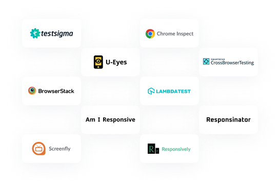
10 Best Responsive Web Design Testing Tools in 2025
1. Testsigma
Testsigma is a codeless, Agentic AI-powered test automation platform for web, mobile, desktop, API, SAP, and Salesforce application testing. Its biggest strengths are the use of AI agents to auto-generate, run, analyze, heal, and optimize test scripts with minimal setup or coding.
With smart agents like Sprint Runner, Generator, Runner, Analyzer, Optimizer, and Bug Reporter, teams automate end-to-end tests fast, scale easily across thousands of browsers and devices, and spend less time on script maintenance. The platform is recognized for making testing simple, faster, and more efficient for everyone, whether building new tests or maintaining existing ones.
Testsigma for responsive web design testing
Key Features:
- AI-driven test automation platform for web, mobile, API, desktop, Salesforce, and SAP
- No-code test creation with plain English scripting
- Runs tests on 3000+ real devices and browsers with parallel execution
- Built-in automated visual testing support
- Integrates easily with CI/CD tools, bug trackers, and collaboration platforms
- Supports cross-device compatibility checks and detailed responsive layout validations, enabling quick detection of UI breaks on different screen sizes
Pros
- AI-powered automation reduces manual effort in responsive test case creation and maintenance.
- Supports testing on thousands of real devices and browsers, ensuring accurate responsive behavior.
- Visual validations help catch layout breaks across screen sizes quickly.
- No-code scripting breaks the barrier for non-technical users.
Cons
- Primarily designed for end-to-end automation, smaller teams focused only on visual responsiveness might find it complex.
2. Google Chrome Inspect (developer Tools)
Chrome DevTools is built into every Chrome browser to help developers manage everything from debugging JavaScript to auditing site performance and security. The Device Mode feature lets teams simulate different screens, throttle network or CPU speeds, rotate devices, set custom device profiles, and show media queries for quick design inspections. People use Inspect for much more than responsive design, it’s a workhorse for inspecting code, emulating sensors, monitoring errors, and quickly capturing screenshots during development.

Key Features:
- Built-in web development and debugging toolkit in Chrome browser
- Features device simulation with preset and custom screen sizes
- Supports touch emulation, screen rotation, and throttling for network and CPU
- Inspect elements and CSS media queries in real time
- For responsive design: Instant viewport switching and media query highlighting make it a handy website responsive testing tool for quick manual checks
Pros
- Completely free and pre-installed in Chrome, making it instantly accessible.
- Device emulation supports a wide range of screen sizes and orientations for manual checks.
- Real-time CSS inspection and media query highlighting speed up debugging for responsiveness.
- Network and CPU throttling are useful for performance testing on mobile simulations.
Cons
- Emulation cannot fully replace testing on real devices due to hardware differences.
- No automated testing or cross-browser responsive testing features.
- Limited to Chrome for testing; no direct multi-browser support.
3. Responsinator
Responsinator is a straightforward online tool that quickly previews any website on popular device frames. It’s designed for designers and developers who want to see how sites might look to real users, without deep technical complexity. Users paste a URL and instantly see desktop, tablet, and mobile simulators; it’s great for presentations and catching obvious display issues, but isn’t intended for advanced automation or debugging.

Key Features:
- Simple online tool to preview websites on popular device frames
- Displays site views on common phones and tablets in portrait or landscape
- Fast, no signup or installation needed
- Provides quick visual feedback to ensure basic site layout adapts to standard device dimensions, useful during early design stages
Pros
- Requires only a website URL to test responsiveness.
- Useful during early design stages for quick layout checks.
Cons
- Does not support interactive testing beyond scrolling and rotating.
- Limited device variety and no browser simulation.
- Not suited for detailed or automated testing efforts.
4. Screenfly
Screenfly lets teams test websites across dozens of screen resolutions, from tiny phones to large TVs, directly from the browser. It’s a no-download solution that’s perfect for manual checks, accessibility validation, or simply seeing design differences across multiple device types. People value Screenfly for its speed and flexibility, offering custom and preset device sizes, device rotation, and basic interaction within the emulated screens.

Key Features:
- Browser-based tool to test sites on multiple screen sizes, including smartphones, tablets, laptops, and TVs
- Offers preset and custom resolution options with rotation and interaction
- Pixel-precise rendering checks across various devices help verify UI consistency for different screen types
Pros
- No software installs or signups required for quick checks.
- Allows custom resolutions and orientation switches.
Cons
- No real-browser or real-device rendering, just viewport simulation.
- Limited testing interaction and no automation capabilities.
- UI can feel outdated and less polished compared to modern tools.
5. LambdaTest
LambdaTest is a cloud-based automation platform designed for teams running manual and automated tests on web and mobile applications. Its top highlight is offering thousands of device-browser combinations on real machines, scalable parallel test execution, integrations with popular CI/CD tools, and rich analytics that help speed up releases. LambdaTest is widely used by global teams who need seamless workflow integration, instant bug reporting, and hassle-free access to advanced test environments.

Key Features:
- Cloud platform offering manual and automated testing on thousands of browsers and real devices
- Supports parallel test execution for faster feedback
- Integrates with popular CI/CD pipelines and defect tracking tools
- Visual regression testing for UI stability
- Enables testing on real device-browser combos with live viewport switching and orientation modes, providing thorough responsive design validation
Pros
- CI/CD integrations facilitate continuous responsive validation.
- Visual regression helps catch unintended UI changes.
Cons
- Can get expensive for smaller teams or individual testers.
- Requires registration and some setup time before use.
- Occasional latency issues reported on some real devices.
6. Am I Responsive
Am I Responsive is a quick visual preview tool for designers who want to see and share how websites render across four core device types: desktop, laptop, tablet, and mobile. Paste a URL, and get an instant split-screen view that can be scrolled, screenshotted, and easily presented to stakeholders. The bookmarklet and localhost testing options make it super handy during early design reviews or client demos.

Key Features:
- Web tool providing a split-screen preview of a site on desktop, laptop, tablet, and mobile device frames
- Allows scrolling and interaction inside device frames
- Bookmarklet support for easy local or live testing
- Quick, shareable visual check focusing on core device form factors to overview responsiveness
Pros
- Very quick visual overview of key device frames with easy sharing options.
- Supports testing local development sites through bookmarklet.
- No cost and minimal setup.
Cons
- Very basic tool; not suitable for in-depth testing or automation.
- Only four device frames, lacks browser variety.
- No interaction beyond static previews.
7. TestCafe
TestCafe is an open-source Node.js-based end-to-end testing framework for web applications. Unlike Selenium or WebDriver-based tools, it doesn’t rely on external drivers or plugins, making setup fast and straightforward. It runs tests directly in the browser, supports modern JavaScript/TypeScript syntax, and works across all major browsers and operating systems. With features like automatic waiting, parallel test execution, and easy CI/CD integration, TestCafe is designed to simplify test automation for modern development teams.

Key Features:
- Cross-browser support, including Chrome, Firefox, Safari, Edge
- Works without WebDriver or additional browser plugins
- Parallel test execution for faster test runs
- Automatic waiting and smart element handling
- Easy integration with CI/CD pipelines (Jenkins, GitHub Actions, etc.)
- Rich API with selectors, assertions, and screenshots
- Supports ES6/TypeScript for test scripting
Pros
- Simple setup with no dependency on WebDriver.
- Consistent test execution across browsers and platforms.
- Automatic waiting reduces flakiness in tests.
- Strong TypeScript support for modern dev teams.
- Active open-source community with ongoing updates.
Cons
- Doesn’t include built-in visual regression testing or responsive testing dashboards.
- Limited ecosystem compared to Selenium or Playwright.
- Advanced debugging and reporting often require third-party integrations.
- Mobile device testing is only via browser emulation, not real devices.
8. BrowserStack
BrowserStack delivers instant access to more than 3500 device and browser environments in the cloud, supporting both live and automated testing of web and mobile apps. It’s known for reliable real-device coverage, deep debugging capabilities, interactive bug reporting, localization checks, video recording, and seamless integration into CI/CD pipelines. Whether for quick manual tests or large-scale automation, BrowserStack helps teams ship with confidence by simplifying the complexity of device fragmentation.

Key Features:
- Video recording, screenshots, and debugging tools included
- Comprehensive CI/CD integrations available
- Real device and browser coverage with interactive viewport switching make it a leading responsive website testing tool for teams needing reliable results
Pros
- Interactive testing supports gestures, rotations, and viewport switching for responsiveness.
- CI/CD pipeline integrations for continuous responsive testing.
- Detailed debugging tools help pinpoint responsiveness issues quickly.
Cons
- Pricey for startups or individual users.
- Advanced features require learning curve for optimal use.
- Limited offline/local testing options without additional setup.
9. U‑eyes
U‑Eyes is a visual checker for web design and UI consistency. Its main focus is helping designers and QA professionals spot layout differences, UI bugs, and compare screens across device types. Unlike heavy automation tools, it’s built to make quick visual reviews precise and straightforward during the design and handoff process.

Key Features:
- Focuses on visual validation for UI consistency across devices
- Offers pixel-perfect layout comparison and bug spotting
- Ideal for quick visual checks rather than full automation
- Helps identify subtle UI mismatches and layout issues on multiple screen sizes
Pros
- Dedicated to visual comparison and UI consistency checking.
- Pixel-perfect detection of layout shifts important for responsive design.
- Simple interface focused on visual bug spotting.
Cons
- Lacks automation and cross-browser device variability.
- Not a full-featured testing platform.
- Limited integrations with other testing tools.
10. Responsively App
Responsively App is an open-source desktop app built entirely for seeing website designs side-by-side across multiple devices. Users love its synchronized navigation, custom breakpoint configuration, and auto-refresh features. With support for real-time testing, element inspection, and adjustable device sets, Responsively App stands out as a daily driver for anyone developing or refining modern multi-device web projects.

Key Features:
- Supports synchronized browsing and custom breakpoint setups
- Live reload and real-time element inspection features
- Enables side-by-side views across multiple device frames with automatic syncing to test responsive layouts dynamically during development
Pros
- Open-source and free with no usage limits.
- Simultaneous multi-device synchronized browsing speeds up responsive UI testing.
- Custom device profiles and breakpoints help mimic real user environments.
- Real-time reloads and element inspection enhance developer workflows.
Cons
- Desktop-only application; no browser-based version.
- Does not support automated testing or cross-browser coverage out of the box.
- Requires manual installation and configuration.
Factors to Consider While Choosing the Best Responsive Web Design Testing Tool
- Device and Browser Coverage: Ensure the tool supports a wide range of real devices, browsers, and operating systems to accurately reflect user experiences.
- Testing Automation Capabilities: Look for support in automating responsive test cases to save time and streamline repeated validation across breakpoints.
- Real-Time Simulation and Interaction: Pick a tool that allows interactive testing, viewport switching, orientation changes, and live debugging for comprehensive coverage.
- Integration with CI/CD and Workflow: Check if the tool integrates easily with your current development, deployment, and bug tracking pipelines for smoother processes.
- Detailed Reporting and Analytics: Choose solutions that offer actionable insights, screenshots, and test logs to quickly pinpoint responsive issues.
- Ease of Use and Accessibility: Make sure the platform has a simple user interface, minimal setup, and helpful support resources for testers and developers.
- AI Capabilities: Emerging agentic AI features in responsive web design tools allow for autonomous testing, healing, and optimization, reducing effort and highlighting unseen issues by simulating real-world user interactions and layouts.
- Codeless Test Automation: Opt for tools that democratize testing with codeless automation, empowering both technical and non-technical users to validate responsive design quickly, without the need for advanced programming skills.
In addition to these practices, it is ideal to follow a responsive design testing checklist to ensure thorough coverage of navigation, font rendering, content placement, interactive experiences, and cross-browser compatibility. This will help your website deliver a smooth, consistent user experience across all devices and screen sizes.
Conclusion
Choosing the right responsive web design testing tool is essential because it ensures your website works smoothly across all devices, improves user experience, and helps avoid costly post-launch fixes. Nowadays, advanced platforms with AI capabilities can run tests autonomously, making testing faster and smarter.
So why settle for less? This blog offers a comprehensive list of the best responsive website testing tools, highlighting modern platforms like Testsigma that combine codeless test automation, real device coverage, and ease of use with advanced AI capabilities to help teams deliver flawless, device-ready sites with confidence.
FAQs
A responsive web design testing tool helps verify that websites work seamlessly across different devices, screen sizes, and browsers, ensuring a consistent user experience and proper layout adaptation.
Responsive web design testing tools are important because they ensure your website looks and works well on all devices and screen sizes. They help improve user experience by making navigation smooth and content accessible, which keeps visitors engaged. These tools also boost SEO rankings by meeting mobile-first search engine requirements and reducing costly fixes after launch by catching design issues early.
Yes, Testsigma is a leading choice due to its Agentic AI-powered, codeless automation, wide device coverage, and integration capabilities, making it excellent for responsive website testing.
Top web design testing tools include Testsigma, BrowserStack, LambdaTest, and TestCafe.
Yes, Responsively App is an open-source tool that offers multi-device synchronized views for responsive design testing.
