




Table Of Contents
- 1 Key Takeaways
- 2 What Does Mobile Friendly Actually Mean?
- 3 Why it Matters and How to Make Your Website Mobile Friendly
- 4 How to Check If Your Website is Already Mobile Friendly
- 5 How to Make a Website Mobile Friendly: 10 Essential Steps
- 5.1 Step 1: Implement Responsive Design With CSS Media Queries
- 5.2 Step 2: Add the Viewport Meta Tag
- 5.3 Step 3: Optimize Page Load Speed for Mobile Networks
- 5.4 Step 4: Use Mobile Friendly Font Sizes and Line Spacing
- 5.5 Step 5: Prioritize Touch-Friendly Design for Navigation
- 5.6 Step 6: Compress and Lazy-Load Images
- 5.7 Step 7: Simplify Forms and Reduce Input Friction
- 5.8 Step 8: Avoid Flash, Intrusive Pop-Ups, and Non-Mobile Elements
- 5.9 Step 9: Test Across Multiple Real Devices and Browsers
- 5.10 Step 10: Support Both Portrait and Landscape Orientations
- 6 How to Test If Your Website is Mobile Friendly After Making Changes
- 7 Common Mobile Friendliness Mistakes to Avoid
- 8 How Testsigma Helps You Continuously Test Mobile Friendliness
- 9 Build It Mobile-First, Then Keep Testing (Conclusion)
- 10 FAQ’s
Key Takeaways
- Website adapts cleanly to small screens with readable text and easy taps
- The same page loads faster and stays stable on mobile networks
- Google now ranks your site based on its mobile version first
- Mobile drives nearly 60% of web traffic globally and most local searches
- Slow page load times and malfunctioning mobile pages result in higher bounce rates and lower conversions
- Mobile sites that don’t work could be deleted from search results
- Use responsive design, the viewport meta tag, and fast-loading assets
- Design touch-friendly buttons, simple forms, and readable fonts
- Test on real devices and re-test after every change
Phones now drive most web traffic, but plenty of sites still feel clumsy on small screens. Small text, buttons too close, and slow pages, these gaps cost rankings and sales.
The good news is that fixing them is straightforward once you know what to check. This guide explains how to make a website mobile friendly and how to do it more quickly.
What Does Mobile Friendly Actually Mean?
A website that is mobile-friendly is made to work well on small screens. That means layouts that can be changed, writing that can be read, buttons that are easy to tap, and fast loading even on slow networks.
In modern web work, mobile usability is built into the design and deployment process, instead of being bolted on at the end.
Mobile Friendly Vs. Mobile-Responsive Vs. Mobile-First
These 3 terms get mixed up often, but they describe different approaches:
| Dimension | Mobile Friendly (Legacy) | Mobile-Responsive (Standard) | Mobile-First (Modern) |
| URLs | Often dual URLs (m.domain.com) | Single URL | Single URL |
| HTML | Separate mobile and desktop versions | Same HTML for all devices | Same mobile-optimized HTML |
| Layout | Scaled-down static containers | Fluid grids via CSS media queries | Fluid layout built from mobile up |
| Asset Load | Risk of heavy desktop assets | May load hidden desktop elements | Lightweight by default |
Mobile friendly is the old scaled-down approach, responsive web design adapts one layout to any screen, and mobile-first design starts small and scales up. Most teams today aim for responsive or mobile-first.
Why it Matters and How to Make Your Website Mobile Friendly
It has now become essential for your website to be mobile friendly. Mobile devices generate the majority of web traffic, and search engines treat the mobile version of your site as primary (mobile SEO).
This matters for designers, QA teams, developers, and product leaders. All of them feel the impact when a mobile layout breaks a checkout flow or a form stops working on a smaller screen.
Google’s Mobile-First Indexing and What it Means for Rankings
Google now uses its smartphone crawler as the primary way of crawling and ranking pages. The mobile version of your page is the baseline its algorithms judge.
If you strip content, internal links, or schema markup from your mobile layout to save space, Google may not see it at all, even if it still lives on the desktop version.
There is also a strict exclusion rule. Sites that completely fail to load on mobile can be removed from search results.
The Traffic and Revenue Impact of a Poor Mobile Experience
A weak mobile experience leaks conversions and suppresses visibility. The link between load times, usability, and revenue is like this:
| Business Metric | Mobile-Optimized | Poor Mobile Layout |
| Bounce Rate | ~9% (loads under 2s) | ~38% (loads 5s or more) |
| Conversion Rate | 15%-30% lift on mobile | Sharp drops from lag and input friction |
| Search Visibility | Full indexing, rich snippet eligible | Risk of exclusion from results |
| User Trust | Repeat visits, higher engagement | Quick abandonment to competitors |
How to Check If Your Website is Already Mobile Friendly
Before fixing anything, run a quick audit to spot rendering issues, slow pages, and indexing warnings:
Using Lighthouse and Pagespeed Insights
Google retired its standalone Mobile-Friendly Test tool and the old Mobile Usability report in December 2023. The checks moved into other tools.
- Chrome Lighthouse: Runs mobile usability, accessibility, and performance audits inside Chrome DevTools.
- PageSpeed Insights: Pulls both lab data and real-world field data with mobile fixes.
- Rich Results Test: Still renders pages as Googlebot Smartphone sees them, with a “View Tested Page” option.
Using the Chrome Devtools Device Emulator
DevTools includes a device toolbar that simulates different screen sizes and hardware limits.
- Open the page in Chrome, right-click, and select Inspect (or Ctrl + Shift + I).
- Toggle device mode with the device icon (or Ctrl + Shift + M).
- Pick a preset like iPhone or Pixel, or enter custom dimensions.
- Rotate between portrait and landscape, and throttle the network to “Fast 3G” to mimic real conditions.
Using Google Search Console
With the old report gone, monitor mobile health through other Search Console reports:
- Page Experience and Core Web Vitals: Show real user metrics split by mobile and desktop.
- URL Inspection Tool: Tests live URLs, shows rendered mobile HTML, and flags blocked resources.
Using a Responsive Checker Tool
Web-based checkers let you view your layout across several device frames at once, without resizing windows by hand.
Testsigma’s free Website Responsive Checker simulates your page across common viewports and flags layout, menu, and touch-target issues for mobiles, tablets, and desktops, no install or signup needed. Start Testing.
How to Make a Website Mobile Friendly: 10 Essential Steps
Here is the practical part. These steps cover how to make your website mobile friendly across design, code, and assets:
Step 1: Implement Responsive Design with CSS Media Queries
Responsive web design is built on fluid grids, relative sizes, and smart breakpoints.
- Avoid fixed pixel widths. Use percentages, viewport units (vw, vh), and relative type units (em, rem) instead.
- Set breakpoints where your content naturally breaks, not for specific phone models.
- A mobile-first stylesheet starts with small-screen styles, then adds @media rules for larger screens.
/* Base styles for mobile */
.container { width: 100%; padding: 1rem; }
.grid-layout { display: flex; flex-direction: column; }

/* Tablets and up */
@media only screen and (min-width: 48rem) {
  .container { max-width: 45rem; }
  .grid-layout { flex-direction: row; }
}
You can also use clamp() to scale fonts smoothly and cut down on extra media queries.
Step 2: Add the Viewport Meta Tag
The viewport meta tag controls how your page scales on phones. Without it, mobile browsers assume a desktop width and shrink everything down.
<meta name="viewport" content="width=device-width, initial-scale=1.0">Place it in the <head> tag. Avoid user-scalable=no or a low maximum scale. Blocking the zoom feature hurts accessibility and fails WCAG guidelines.
Step 3: Optimize Page Load Speed for Mobile Networks
Mobile connections tend to lag (and are improving, fast), thus speed is a factor. Google measures it using Core Web Vitals at the 75 percentile of real visitors.
| Metric | Good | Needs Work | Poor |
| LCP (load speed) | ≤2.5s | 2.5s–4.0s | >4.0s |
| INP (responsiveness) | ≤200ms | 200ms–500ms | >500ms |
| CLS (visual stability) | ≤0.1 | 0.1–0.25 | >0.25 |
To improve these:
- Cut server response times with a CDN and caching
- Defer non-critical CSS and JavaScript
- Break long scripts into smaller async tasks to keep the page responsive.
Step 4: Use Mobile Friendly Font Sizes and Line Spacing
Text should be readable without pinching to zoom. Make sure to:
- Keep body text at least 16px; secondary text no smaller than 12px
- Set line height between 1.5 and 1.7, and keep lines to 70–75 characters
- Maintain a contrast ratio of at least 4.5:1 for readability
Step 5: Prioritize Touch-Friendly Design for Navigation
Fingers are less precise than a mouse, so targets need a bit of wiggle room.
- Google recommends interactive targets of at least 48×48 CSS pixels with 8px of spacing (padding)
- WCAG 2.2 sets a floor of 24×24 CSS pixels, or smaller with enough spacing around them
- Replace dense hover menus with a hamburger menu or sticky bottom navigation
.primary-cta {
  min-width: 48px;
  min-height: 48px;
  padding: 12px 24px;
}
Step 6: Compress and Lazy-Load Images
Images often make up most of a page’s weight, so they are a top priority. You should:
- Serve modern formats like AVIF or WebP, which cut file size by 30%–50%
- Use srcset and sizes so the browser picks the right resolution for each screen
- Avoid lazy loading for images below the fold
One warning: Never lazy-load the main above-the-fold image, since that delays your LCP. Preload critical images instead.
Step 7: Simplify Forms and Reduce Input Friction
Forms are where mobile users drop off most. Try to cut the friction wherever possible by:
- Using specific input types (type=”email”, type=”tel”, type=”number”) to trigger the right keyboard
- Adding inputmode and autocomplete so browsers can prefill and show the correct keypad
- Placing labels above fields, keep forms short, and avoid auto-focus that pops the keyboard on load
These are general fixes. Depending on your form type and website, decide what works for your niche.
Step 8: Avoid Flash, Intrusive Pop-Ups, and Non-Mobile Elements
Drop legacy tech like Flash that won’t render on modern phones. Google also demotes pages with intrusive pop-ups that block content right after a visitor arrives from search. There is a clear line between penalized and permitted overlays.
| Type | Examples |
| Penalized | Full-screen pop-ups that hide content, on-load interstitials |
| Permitted | Cookie or GDPR notices, small dismissible banners, login paywalls |
If you must show a pop-up, keep it small, delay it, and give the close button a generous touch target.
Step 9: Test across Multiple Real Devices and Browsers
Resizing a browser window is often not the same as mobile device testing approaches on real hardware. Emulators can’t reproduce iOS Safari’s WebKit engine versus Android Chrome’s Blink engine, real finger taps, or slow device CPUs.
Real device testing is the only way to confirm layout stability, touch accuracy, and performance under real network conditions.
Step 10: Support Both Portrait and Landscape Orientations
People rotate their phones often, especially for video and tables. Ensure to:
- Make sure fluid grids adapt when the screen rotates
- Test video players, galleries, and data tables so nothing overflows in landscape
- Account for the shorter height in landscape so sticky headers don’t cover content
How to Test If Your Website is Mobile Friendly after Making Changes
Once your changes are live, use these steps to make the website responsive and validate them so layout, speed, and functions hold up.
Manual Testing on Real Devices
Manual checks on physical phones catch the human details that automation can miss. Start by:
- Confirming text is readable without zooming
- Tapping buttons and links to make sure they don’t trigger neighbors
- Testing carousels, accordions, form validation, and video playback
Automated Mobile Responsiveness Testing with Testsigma
Manual testing alone can’t cover every device and browser combination. That’s where mobile responsiveness testing at scale helps.
Testsigma is an AI powered cross platform testing platform. Teams may test on a massive cloud grid of real iOS and Android devices and thousands of browser and OS combinations. Which means they aren’t confined to emulators.
Tests can be written in plain English. Steps like “Tap on Checkout” or “Verify element contains label,” let QA analysts and non-developers build cases without code.
Visual snapshots also help catch layout shifts across devices automatically.
What to Check after Deployment
Use a focused responsive design testing checklist for your validation pass.
| Category | Goal | What to Verify |
| Layout | No horizontal scroll | Content width matches viewport |
| Touch Targets | Easy taps | 24×24px minimum or enough spacing |
| Typography | Readable everywhere | Body text 16px+ with relative line height |
| Load and Response | Fast and smooth | Mobile LCP ≤2.5s, INP ≤200ms |
| Forms | Correct keyboards | Semantic inputs trigger right keypads |
Common Mobile Friendliness Mistakes to Avoid
Even strong teams slip up during website mobile optimization. A few mistakes affect rankings the most:
- Content asymmetry: Removing text, links, or schema from the mobile version. Since Google indexes the mobile page, anything missing there is missing from search.
- Hiding content behind heavy JavaScript: Accordions and tabs are fine, but content that only loads through custom click scripts may be skipped by crawlers.
- Sitemap and robots.txt conflicts: Listing pages in a sitemap while blocking them in robots.txt sends mixed signals. Use absolute URLs, include only canonical pages, and make sure CSS and JS stay crawlable.
Many teams test only by shrinking their desktop browser. This hides real issues like touch accuracy and slow device performance that only show up on actual hardware.
How Testsigma Helps You Continuously Test Mobile Friendliness
Mobile friendliness isn’t a one-time fix. Every UI update can break a layout or a form, so testing needs to keep pace with your release cycle.
Testsigma helps teams create, run, and maintain these tests with less effort, which fits naturally into a CI/CD workflow.
Real Device Access at Scale
Testsigma provides access to a large grid of real iOS and Android devices plus thousands of browser and OS combinations.
This removes the need to maintain an in-house device lab and lets teams test real gestures, locations, and network speeds.
No-Code Test Creation
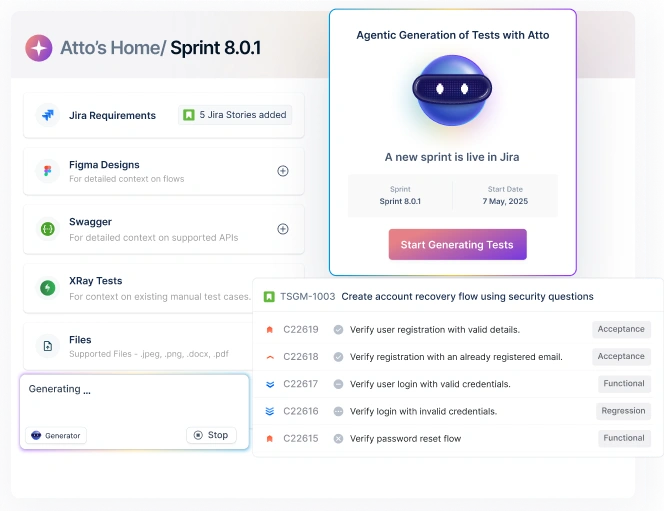
Using natural language, testers write cases in plain English. Testsigma’s AI can also turn requirements, Jira stories, or design files into structured test cases, then run them in parallel across many devices at once.
AI-Powered Self-Healing Tests
When UI elements change, renamed classes, moved buttons, updated IDs, traditional scripts break and create false failures.
Testsigma’s self-healing capability detects the change, finds the closest matching element, and updates the locator during execution.
Every fix is logged so QA managers can review or roll it back, which cuts a large share of routine maintenance work.
Free Website Responsive Checker
For a quick visual check, Testsigma’s free Website Responsive Checker loads any URL across common viewports.
You can confirm column alignment, text formatting, and touch layouts in seconds, no account required.
Testsigma helps QA teams test mobile friendliness across real devices and browsers, write tests in plain English, and reduce maintenance with self-healing. That means faster feedback and more confidence before you ship. Start Testing.
Build it Mobile-First, Then Keep Testing (Conclusion)
Making a website mobile friendly comes down to a clear set of steps. Responsive design, a proper viewport tag, fast load speed, readable fonts, touch-friendly buttons, optimized images, and simple forms are all parts of this process.
However, building it right requires mobile usability testing, especially as your site elements change frequently.
Pairing a solid mobile-first design with consistent responsiveness testing keeps your site fast, usable, and visible in search.
To make that testing easier, you can start a free trial of Testsigma and validate your mobile experience across real devices and browsers in minutes.
FAQ’s
A mobile friendly site reshapes its layout, text, and navigation to fit any screen. The essentials are a responsive CSS layout, a viewport meta tag, fast load times, touch-friendly buttons, and readable fonts. Google treats mobile-friendliness as a key ranking signal through mobile-first indexing.
Run a quick check in Lighthouse or PageSpeed Insights and review the result. You can also open Chrome DevTools and preview your site across screen sizes. For wider coverage, use a responsive checker tool or Google Search Console.
Add the viewport meta tag to your <head>, then apply CSS media queries at common breakpoints like 480px, 768px, and 1024px. Compress images, raise body text to 16px, and keep tap targets near 44×44 pixels. For most sites, these CSS tweaks are enough.
Yes, significantly. Google uses mobile-first indexing, so it ranks based on your mobile content, not desktop. Pages that fail mobile usability checks can lose rankings or visibility, even with a strong desktop version.
A simple site needs only a few hours for a viewport tag, responsive CSS, and compressed images. A full redesign of a complex site can take days to weeks. Cross-device testing usually takes the longest.