


Prompt Templates for Pro-level test cases
Get prompt-engineered templates that turn requirements into structured test cases, edge cases, and negatives fast every time.
TL;DR
Responsive checking ensures your website design, usability, and functionality perform well on all screen dimensions and devices. Here are three ways to carry it out on Chrome:
- Chrome DevTools
- Extensions
- Online testing tools like Testsigma
For best results, use a combination of Chrome testing, real device testing, and Testsigma’s automated platform. This ensures complete coverage across all possible device configurations with minimal manual intervention to secure accurate testing results.
Mobile users now represent over half of global web traffic. Yet countless websites still fail basic mobile compatibility tests. Your perfectly crafted desktop layout might perform flawlessly on your monitor, but it could be completely broken on smaller screens.
Not to forget, your tablets, 2-in-1 laptops, and different phone models come with unique screen dimensions.
If you’re only checking how your website works on PC or even testing just iPhone and Android defaults, you’re making a huge mistake. One that will cause bounce rates to climb, traffic to drop, and search rankings to fall – ultimately hitting your revenue.
However, responsive website testing lets you catch these performance issues during development rather than discovering them after launch.
This guide discusses the importance of website responsiveness, how to check responsive website in Chrome and practical techniques to improve your testing strategy for better outcomes.
Table Of Contents
- 1 Website Responsiveness: Why Is It Important For You?
- 2 Real Device Testing Vs. Emulation: What Approach Should You Go With?
- 3 How To Check Responsive Website In Chrome?
- 4 The Best Testing Approach: Automated Testing With Testsigma
- 5 Common Problems In Responsive Testing And Their Solutions
- 6 Best Practices To Implement For Successful Responsive Testing
- 7 Final thoughts
Website Responsiveness: Why is it Important for You?
Website responsiveness refers to your site’s ability to automatically adapt its layout, content, and functionality across different screen sizes and devices. Your web shifts and reorganizes itself without losing functionality or readability across devices.
Here’s why a responsive website matters:
- Better user experience: When your website adapts to any screen size, users can go through the webpages easily and navigate without zooming or scrolling horizontally. This creates smoother interactions that keep people engaged with your brand.
- Higher search rankings: Google considers your website’s responsiveness as a key ranking factor when determining search positions. Sites that fail to work correctly on different devices get penalized, while those that work get traffic and visibility.
- Increased conversions: Responsive design eliminates barriers that prevent users from completing actions like purchases or form submissions. When your buttons, menus, and checkout processes work smoothly, more visitors convert into customers.
- Reduced bounce rates: No user will stay on your website with broken layouts, tiny text, or overlapping content. When users continuously leave because of poor mobile experiences, your bounce rate rises, and search engines consider your site of lower quality.
Real Device Testing Vs. Emulation: What Approach Should You Go with?
When testing website responsiveness, you have two main approaches: using real physical devices or relying on emulated environments that simulate device behavior. While both work well, they deliver different levels of accuracy and insight.
Once you understand how they differ, you can pick the right approach based on your project needs.
| Aspect | Real device testing | Emulation |
| Definition | Testing on actual physical devices (phones, tablets, desktops) hosted locally or in the cloud | Testing on a simulated environment that mimics a device’s screen size and behavior within a browser or tool |
| Accuracy | It reflects real-world performance, hardware limitations, touch interactions, and OS-specific behaviors | It only simulates screen size and some behaviors, not actual device performance or hardware quirks |
| Performance testing | Can measure true speed, battery usage, memory load, and network behavior | Cannot fully replicate CPU, GPU, or memory constraints of real devices |
| Interaction testing | Allows testing gestures, multi-touch, sensors, and hardware features (camera, GPS, vibration) | Cannot fully simulate advanced interactions like pinch-to-zoom or hardware-based sensors |
| Cost and setup | Requires more resources, as you need to either buy devices or use a paid cloud device farm | Free and quick to set up using tools like Chrome DevTools |
| When to use | Final pre-launch QA, catching complex bugs, and testing critical workflows | Early-stage design checks, quick layout reviews, or developer debugging |
How to Check Responsive Website in Chrome?
Chrome holds over 69.23% of the global browser market share, so making sure your website works well on this platform is pretty much non-negotiable.
The good thing is you have different practical options available that let you test how your website appears and functions in Chrome across different screen sizes without needing multiple devices. Let’s take a look at them:
- Using Chrome developer tools
Using Chrome developer tools allows you to test responsive layouts directly in your browser. Here are instructions on how to go about this testing process:
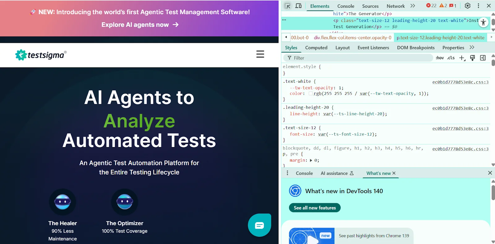
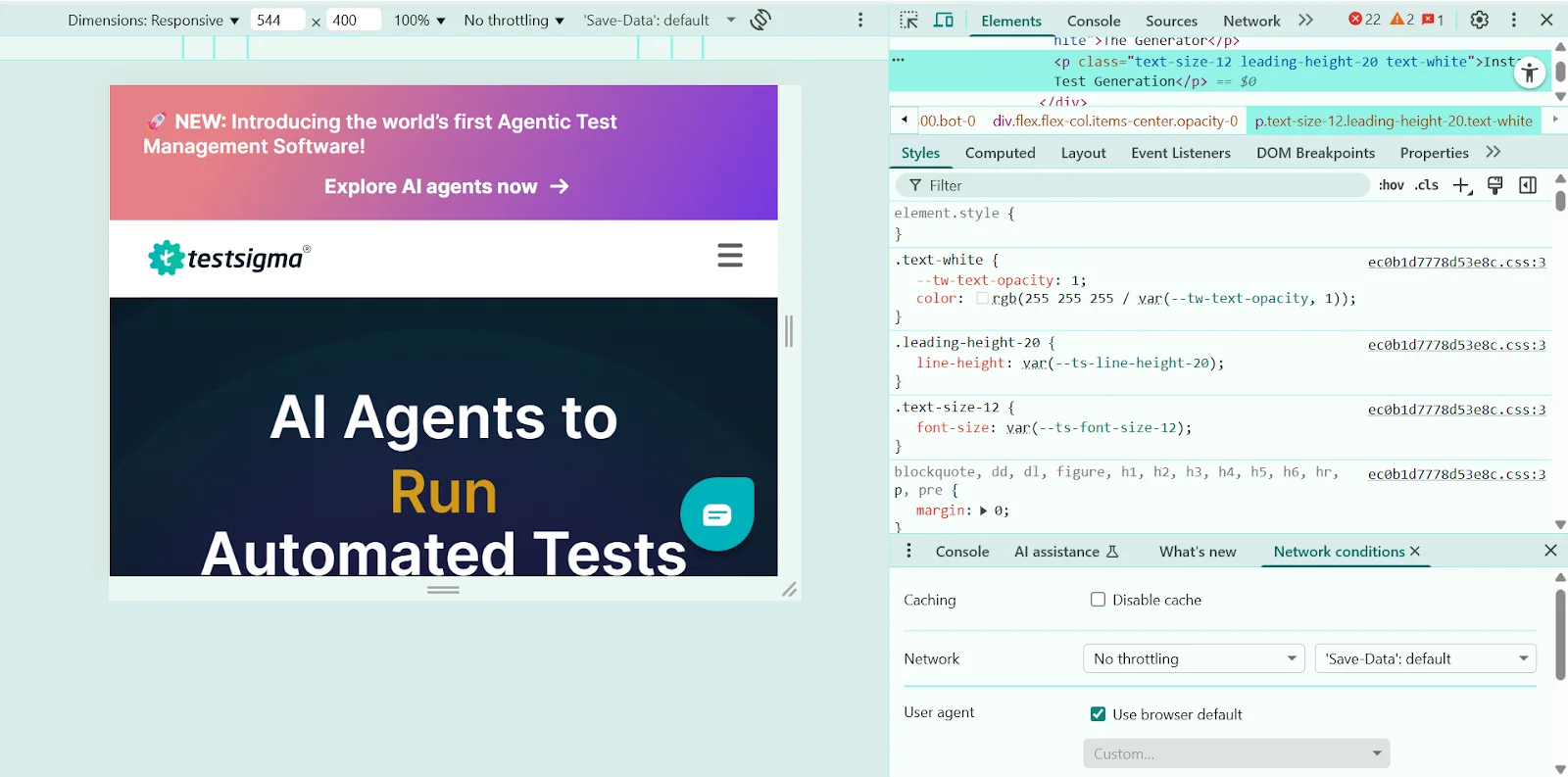
Step 1: Open Chrome Developer Tools

Open the website you want to test in Chrome. Then right-click anywhere on the page and select Inspect or use the shortcut:
- Windows/Linux: Ctrl + Shift + I
- Mac: Cmd + Option + I
Once opened, the developer tools panel will appear, usually at the right side or bottom of your screen.
Step 2: Enable device toolbar (responsive design mode)
At the top of the developer tools panel, click the toggle device toolbar icon, which looks like a small phone and tablet side-by-side. You can also use the shortcut:
- Windows/Linux: Ctrl + Shift + M
- Mac: Cmd + Shift + M
This switches Chrome into responsive design mode, allowing you to preview how your website looks on different devices.
Step 3: Choose a device or set custom dimensions
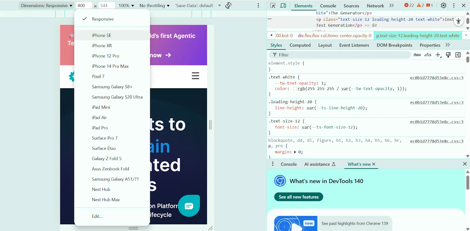
Use the device dropdown menu at the top of the viewport to select a preset device such as iPhone 14, Pixel 7, or iPad Air. To customize dimensions, manually enter a width and height in the fields provided or drag the viewport edges to resize freely.
Step 4: Test different orientations and breakpoints
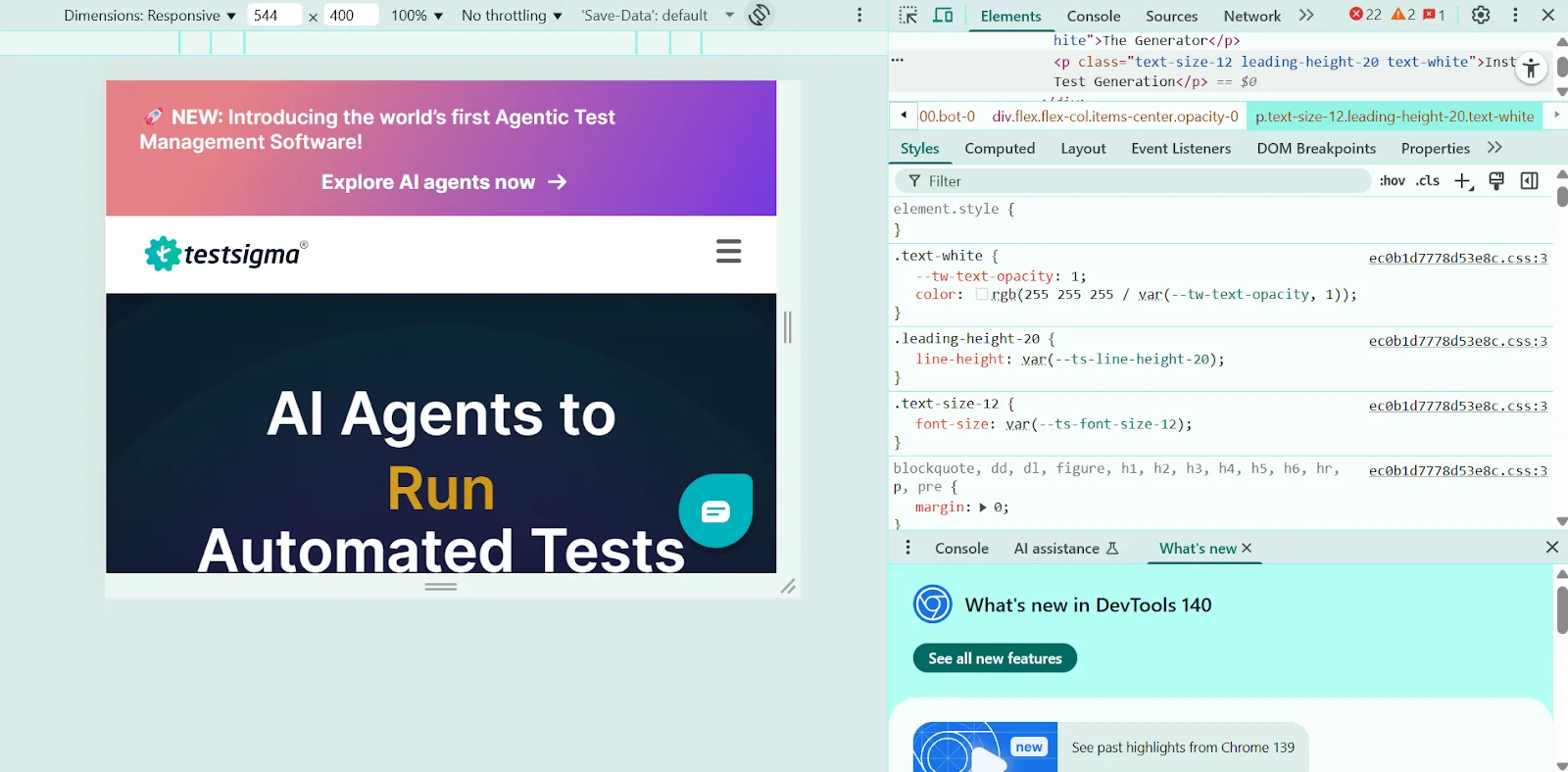
Click the Rotate icon near the device dropdown to switch between portrait and landscape modes. You can also drag the sides of the viewport to move through various breakpoints and assess how your layout adapts.
Toggle ‘Show Media Queries’ from the menu to visually display breakpoints defined in your CSS.
Step 5: Simulate network speeds and performance
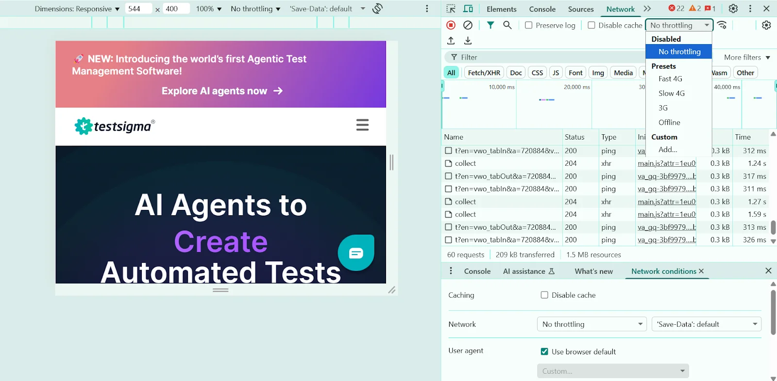
See how your site behaves on slower networks or devices:
- Go to the network tab and select a speed like Fast 3G or Slow 4G under the throttling dropdown.
- Check ‘Disable cache’ to simulate a true first-time visitor experience.
For performance testing, open the performance tab, and use CPU throttling to mimic slower devices.
Step 6: Debug layout and responsive elements
In the elements tab, hover over components to see box model overlays for margins, padding, and boundaries.
- Identify issues like overlapping elements, horizontal scrolling, or text clipping.
- Use Flexbox/Grid overlays to visualize complex layouts and troubleshoot alignment issues.
Step 7: Repeat for multiple devices and finalize checks
Make sure that you’ve tested on at least one smartphone, tablet, and desktop resolution while ensuring that these elements function properly:
- Navigation menus and buttons
- Form fields and input types
- Images and icons (check sharpness on high-DPR screens)
Once done, complete your testing with final checks in both portrait and landscape orientations.
- Using Chrome extensions
While Chrome’s built-in tools are suitable for basic testing, extensions provide additional features that can speed up your workflow. You will find many extensions on the Chrome Web Store that help with responsive design testing and offer unique features.
Here are a few of the popular extensions available for testing:
- Responsive viewer: This extension allows you to preview your site across various screen sizes and devices simultaneously. You get customizable breakpoints and synchronized scrolling for real-time testing, which makes finding layout issues much faster.
- Window resizer: This tool resizes your browser window to mimic different screen resolutions. It features predefined screen sizes, customizable dimensions, and keyboard shortcuts that let you test various breakpoints without manual resizing.
- Responsive tester: If you prefer a simple method, Responsive tester is the ideal pick. All you have to do is just open the extension, select a device from the dropdown menu, and instantly see how your site appears on that specific device.
- Viewport resizer: It simplifies testing across multiple devices by offering quick previews of different screen sizes. With custom device profiles and mirrored interactions that automatically sync your actions across all viewports, you don’t need to repeat the same tests on each screen size.
The Best Testing Approach: Automated Testing with Testsigma
While Chrome’s built-in tools offer valuable testing capabilities, they have certain limitations. DevTools only simulates devices rather than testing on actual hardware. It can’t detect browser-specific rendering issues, and requires manual checking of each screen size individually.
That’s why automated cross-browser testing is a better option. It lets you test on real devices simultaneously, detects browser-specific bugs, and runs tests automatically across multiple configurations at once.
Testsigma is one of the best platforms for cross-browser testing tools. This cloud-based platform lets you write tests in plain English without coding, then runs them across real browsers and devices automatically.
You can create responsive test scenarios once and execute them on multiple configurations at once, catching layout issues and functionality problems before they reach users.
Here are the key benefits you get when you invest in the Testsigma solution:
- Real device access: Test on actual mobile devices, tablets, and desktops rather than just emulators.
- Cross-browser coverage: Verify functionality across Chrome, Firefox, Safari, Edge, and mobile browsers.
- Parallel test execution: Run tests simultaneously on multiple device-browser combinations to save time.
- Visual validation: Capture screenshots automatically to spot layout issues and design inconsistencies.
- AI-powered maintenance: Find self-healing tests that adapt to minor UI changes without manual updates.
- Comprehensive reporting: Get detailed insights into which devices or browsers show problems.
Testsigma offers both free and premium tiers. The free version covers basic testing needs with limited execution hours, while premium plans provide unlimited test runs, advanced integrations, and priority support.
Common Problems in Responsive Testing and Their Solutions
Even experienced testers run into tricky problems during responsive testing. Here are the most common issues and how to solve them:
Problem 1: Chrome’s device simulation doesn’t always match real device behavior.
Solution: Use automated cross-browser testing tools to test on actual device hardware instead of simulation. This catches layout issues that Chrome’s emulation misses and ensures your design works exactly as users experience it.
Problem 2: Desktop hardware makes responsive sites appear faster than they actually perform on mobile devices.
Solution: Make sure to enable CPU and network throttling in Chrome DevTools to mimic real mobile conditions. Test under 3G speeds and slower processors to identify performance bottlenecks that only surface on actual mobile devices.
Problem 3: Standard device presets miss issues at custom screen widths.
Solution: You need to test beyond standard device sizes by dragging the viewport handle through all width ranges. Try to focus on gaps between common breakpoints where layouts often break unexpectedly.
Problem 4: Lack of communication during responsive testing leads to duplicate work and missed bugs.
Solution: Use shared testing environments and document findings with screenshots at specific viewport sizes. Plus, establish standard testing procedures and device lists to ensure everyone tests consistently across the same breakpoints and conditions.
Best Practices to Implement for Successful Responsive Testing
For responsive testing, you need more than just the right tools or methods. Here are practical tips to build a solid testing strategy that catches every issue and ensures a seamless web experience.
- Test actual devices: Chrome’s device emulation helps during development, but real devices show issues that simulation misses. So, you need to test on popular phones and tablets that your users actually own.
- Optimize for accessibility: When testing responsive layouts, make sure all text stays readable at different sizes. Plus, test that colors have enough contrast and buttons, links, and other interactive elements are big enough for users with motor difficulties.
- Test device orientations: Users rotate their devices constantly between portrait and landscape modes. Make sure to verify your layout works in both orientations, especially for tablets where landscape mode is common.
- Check navigation menus: Mobile navigation often collapses into hamburger menus or changes structure entirely. So, test that all menu items remain accessible and functional across different screen sizes.
- Document specific findings: Make sure to record exact pixel widths where issues occur. This helps developers fix problems faster and prevents team members from testing the same issues repeatedly.
- Monitor responsiveness regularly: Websites break over time due to content updates, new features, and browser changes. Set up automated responsive tests that run with each deployment to catch issues before they reach users.
Final Thoughts
With users switching between phones, tablets, and desktops throughout their day, your website needs to be responsive on every screen out there.
Chrome DevTools offers you a solid starting point with device simulation and debugging tools that help spot layout problems quickly during development.
However, the best approach is to combine Chrome testing with actual device testing and automated cloud platforms. This way, you can catch issues that browser simulation misses while getting the coverage you need without investing in multiple devices.
Testsigma’s automated platform lets you easily access real devices through cloud infrastructure. The platform’s no-code approach makes testing accessible to teams without extensive technical expertise, while its AI-powered features streamline the entire testing process.
So, are you ready to test your website? Sign up for Testsigma today to create a perfectly responsive website that works on every device.

